Devlog #04: Production Sprint 1 – Week 1
Hello everyone, this week the Crowned Control team has started with the production phase. It will consist of two sprints, both lasting for three weeks. This will give us a better overview of our progress and help us keep on track.
Art
Concepts
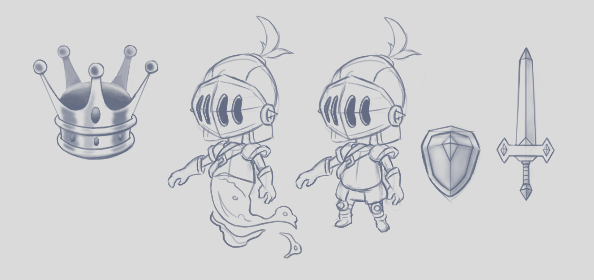
This week the artists started creating concept art for the most important props like the player character, weapons, the crown and the level layout. We tried to keep in mind the design elements mentioned in our Art Bible in terms of the shape language and level of detail as well as the proportions. We then continued to convert our design to 3D in the modeling software Maya.
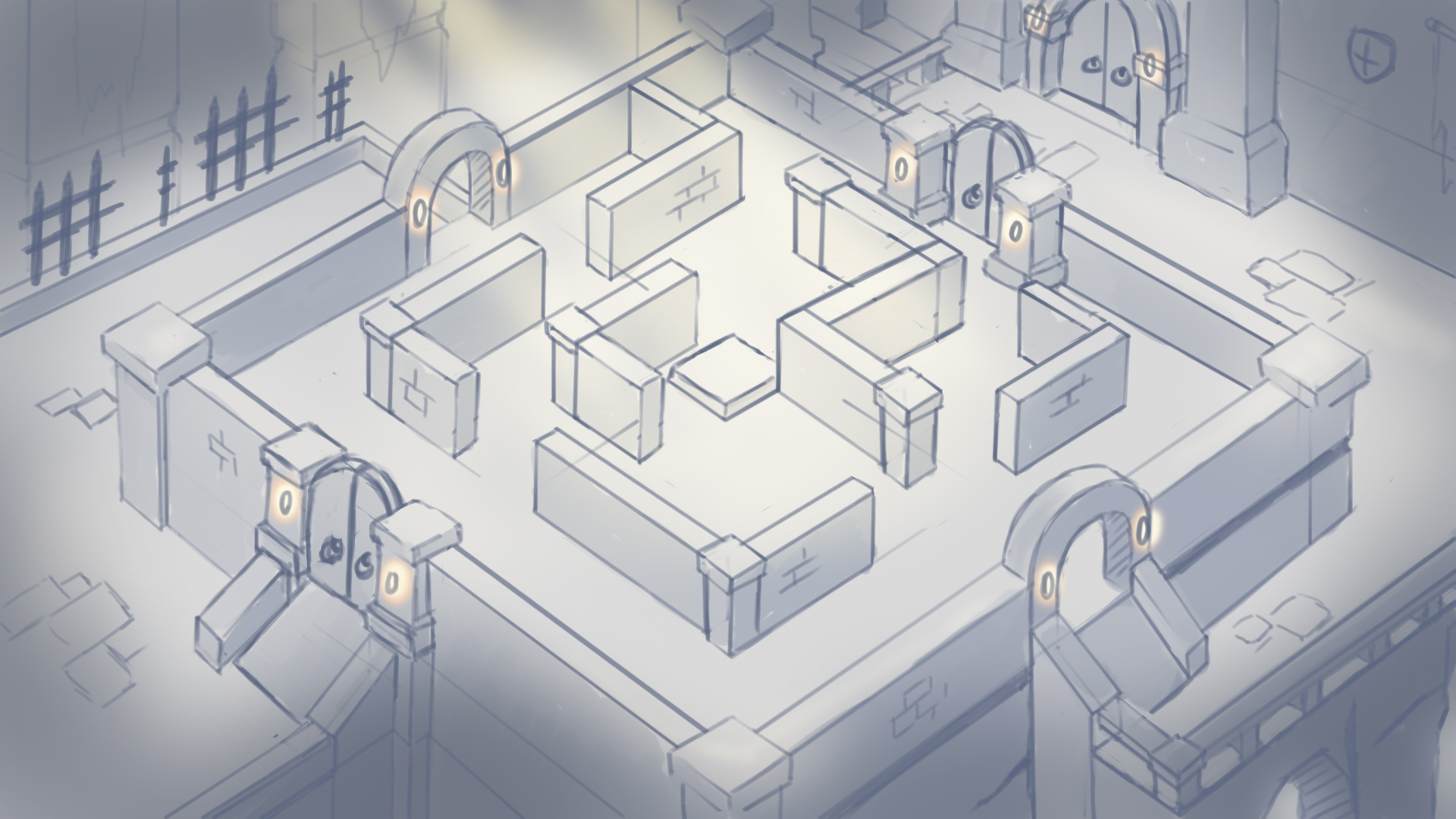
We experimented with different level layouts for our game taking into account the feedback from our supervisors. This layout was necessary to start blocking out our level in Unity. The level takes into account our chosen top-down view. We are going for quite a symmetrical composition with some asymmetrical elements to keep it interesting. Walls and pathways are spread out over the level asymmetrically to make sure the gameplay doesn’t become repetitive or easy to predict. The level takes into account background elements as well as depth which will be enhanced by atmospheric fog.
Modelling
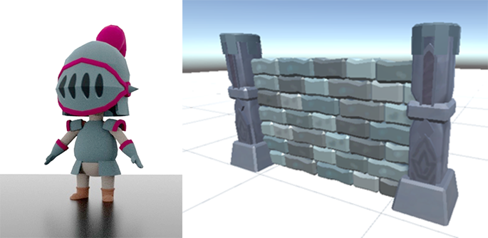
We started on modelling our objects, starting with the most important aspects of our game so we can begin implementing these into our engine. These models have been modelled and unwrapped, in addition to being implemented in Unity which means adding our toon shader and outline to them. We are currently using simple flat colors with minor detailing for our textures. Within the engine we will be adding a color gradient to our model to add depth and interest.
Shaders and RFX
First and foremost the Universal Render Pipeline (URP) needed to be set up. This was crucial since we need to create Shader Graphs and add additional Renderer Features. The early implementation of these Renderer Features is really important for calculated and non-calculated reasons. The first one refers to the intended results acquired by the use of our outline generating material and the material that returns the pixels in a cartoony fashion. The latter one refers to the fact that there are a lot of variables and factors that it becomes basically inevitable that unexpected interactions occur between these post-process effects and the base visuals generated by a variety of RFX and other shaders. Some of these interactions will be a welcome surprise, while the rest will become something that needs to be fixed. The main message here is that we hope to become aware of these encounters early on. This way, our group will have a lot more time to generate appropriate approaches.
Once the URP was set up in the project, it became important that the main shaders pertaining to readability and the art style were finished as quickly as possible. The formula used to attain the desired effect requires base materials independent from the post-process materials. One such source Shader Graph was created for the non-player meshes and another one was created for the player meshes. This distinction was important since the amount of lines executed in materials used for the player meshes were much higher than the number of lines executed for the non-player mesh oriented materials.
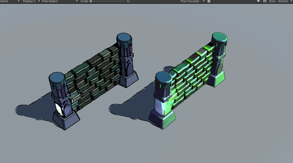
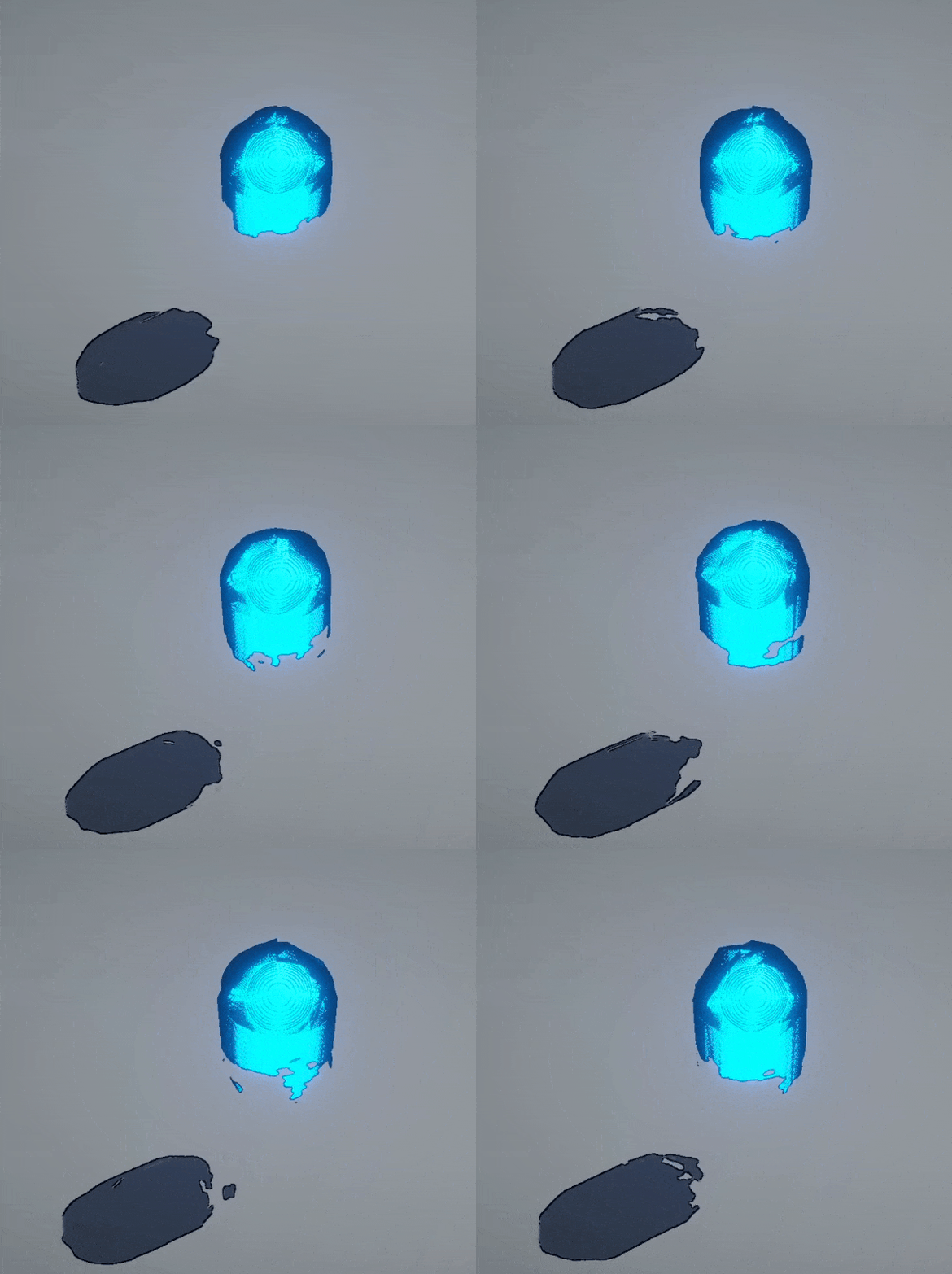
One of the main distinguishing features of the player mesh oriented Shader Graph was the inclusion of the Ghost Mode. This variable, once activated, would generate an alternate material tailored for the needs of being interpreted as a ghost. Subtle vector displacement, saturated emission (contrasting the surroundings in this context) and partially masked areas on the mesh allowed the creation of the ghost material.
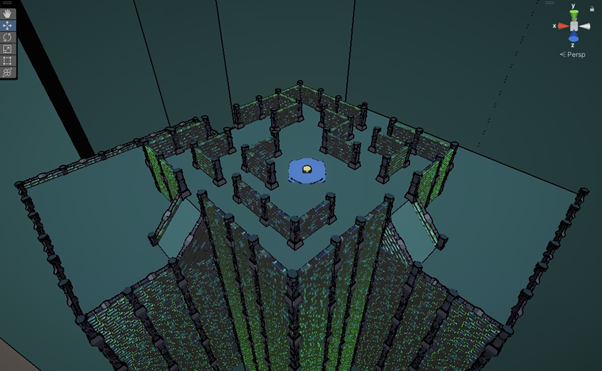
Blocking out the level was done after the concept of the level lay-out was produced. Since we prioritized the production of the assets that would be used the most in the scene, it became possible to utilize the actual meshes that would become part of the final product in our blockout. This was useful to get a more accurate feeling of how the visuals will actually look and feel like at the end of production.
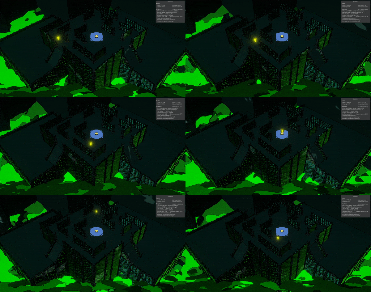
The blockout allowed us to place the main lighting and already become aware of the potential happy accidents and the undesired effects of different elements in the scene interacting with one another. For the sake of proper immersion, ghastly fog was put in the level as well.
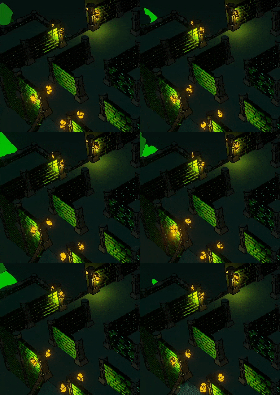
The flames of the torches that would be placed in the dungeon corridors were put in the scene as well. By already placing smaller elements like these (only the ones that would strongly affect the feel of the perceived whole screen) to our level, a real-time feedback becomes possible. Instead of guessing how the whole will turn out in the end, this method allows our artists (throughout the production) to tweak the settings necessary to achieve greater clarity for the players in context of visuals,. Restrictions become manifest early on in the production phase as well, allowing us more time to develop and find clever solutions for it. The gradual polish will make our job easier during the polish phase, since we will have a much better grasp on what is needed and therefore be more prepared.
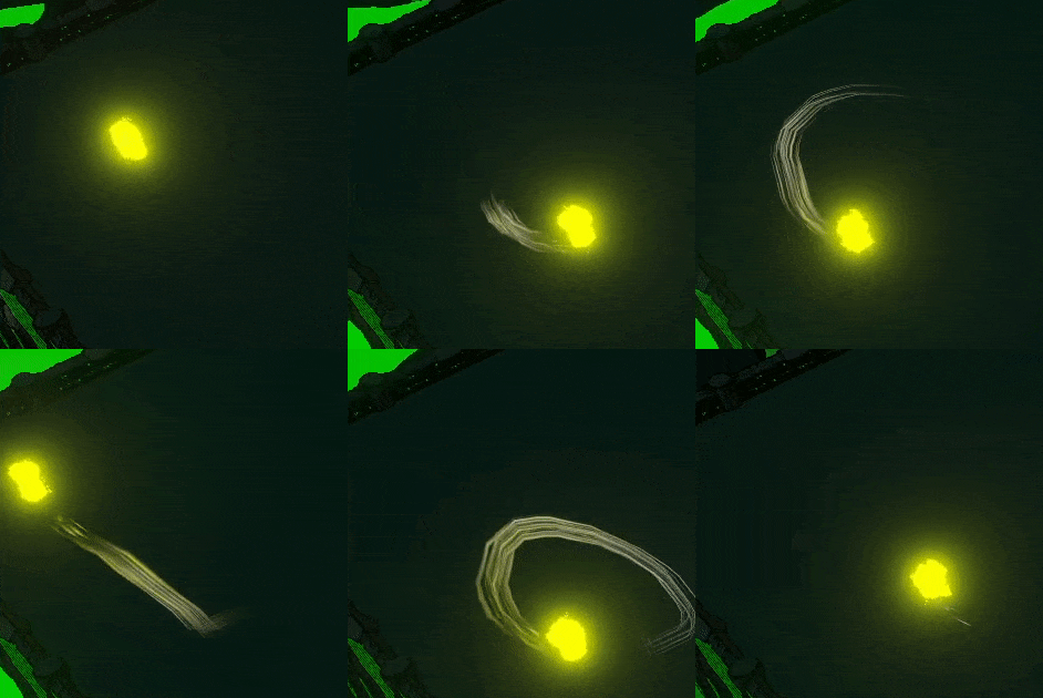
We tried to already finish RFX that would benefit the players the most and postponed the other effects that had no major impact on the gameplay’s feel. Trails and a subtle light emission at the feet of our player meshes were a few of these relatively important effects.
Programming
When it comes to programming, we had to restart from scratch. See it as a clean slate to build our game on, using the lessons learned from our weeks of prototyping to get a clean codebase, without having to struggle through the issues we had in the previous weeks.
This week we focused on getting the basics in there, that being movement, attacking, our crown mechanic and the necessary framework to implement our items with. Traps will unfortunately have to wait a bit, but they're on their way as well (and better than ever!)
Let's start with the knights themselves. We implemented a 'player manager' object, which keeps track of how many players there are, who's closest to winning and (re)spawning our little knights when necessary. Having a single object manage all these makes it a lot easier to pull data for the HUD later on, while also keeping all our overarching mechanics in one easily accessible place. This way we don't have to sift through all our players whenever we want to, for example, get the exact amount of seconds each player is away from winning the round.
Secondly, attacking. It's relatively straight-forward, just like it was in the prototypes. However, this time around we decreased the charge-up time needed to perform a charged attack. You also now dash a short distance forward whenever you perform such a charge. The crowned knight still has its old total of 3 hp, which means they can be taken down with either a well-timed charged attack or some good old light swings.
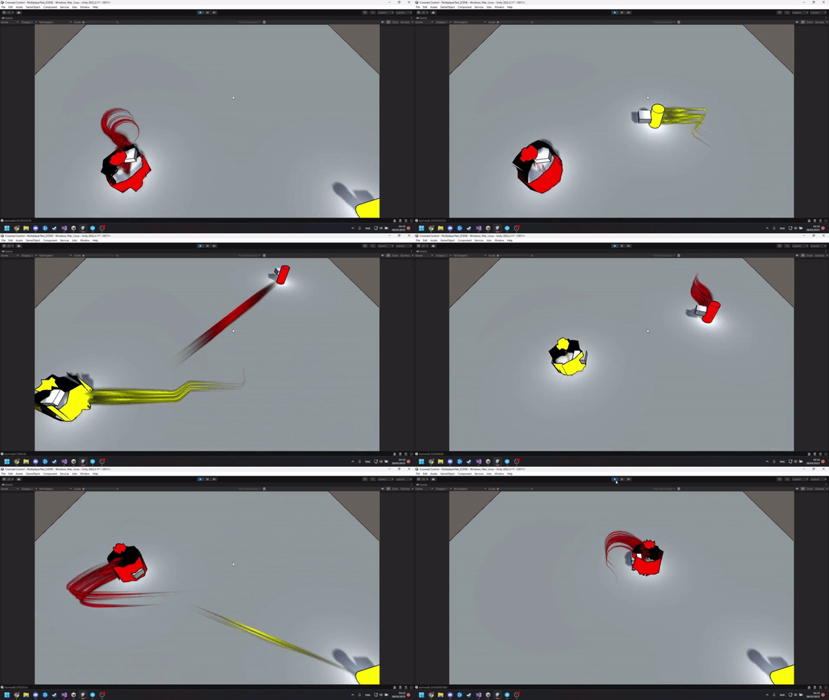
Whenever knights are hit by a light attack, which includes your fellow uncrowned knights, they will be pushed back once more. The code for this has gotten a major overhaul and, even though it is not visible in the game, will be much easier to work with from now on!
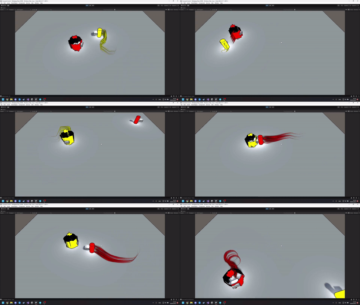
Thirdly, the crown. Not a whole lot changed here, but we can now implement different shaders instead of mere color shifts, it's bound to look pretty cool! For now though, our little cylinder that represents the knight will just get a little spookier.
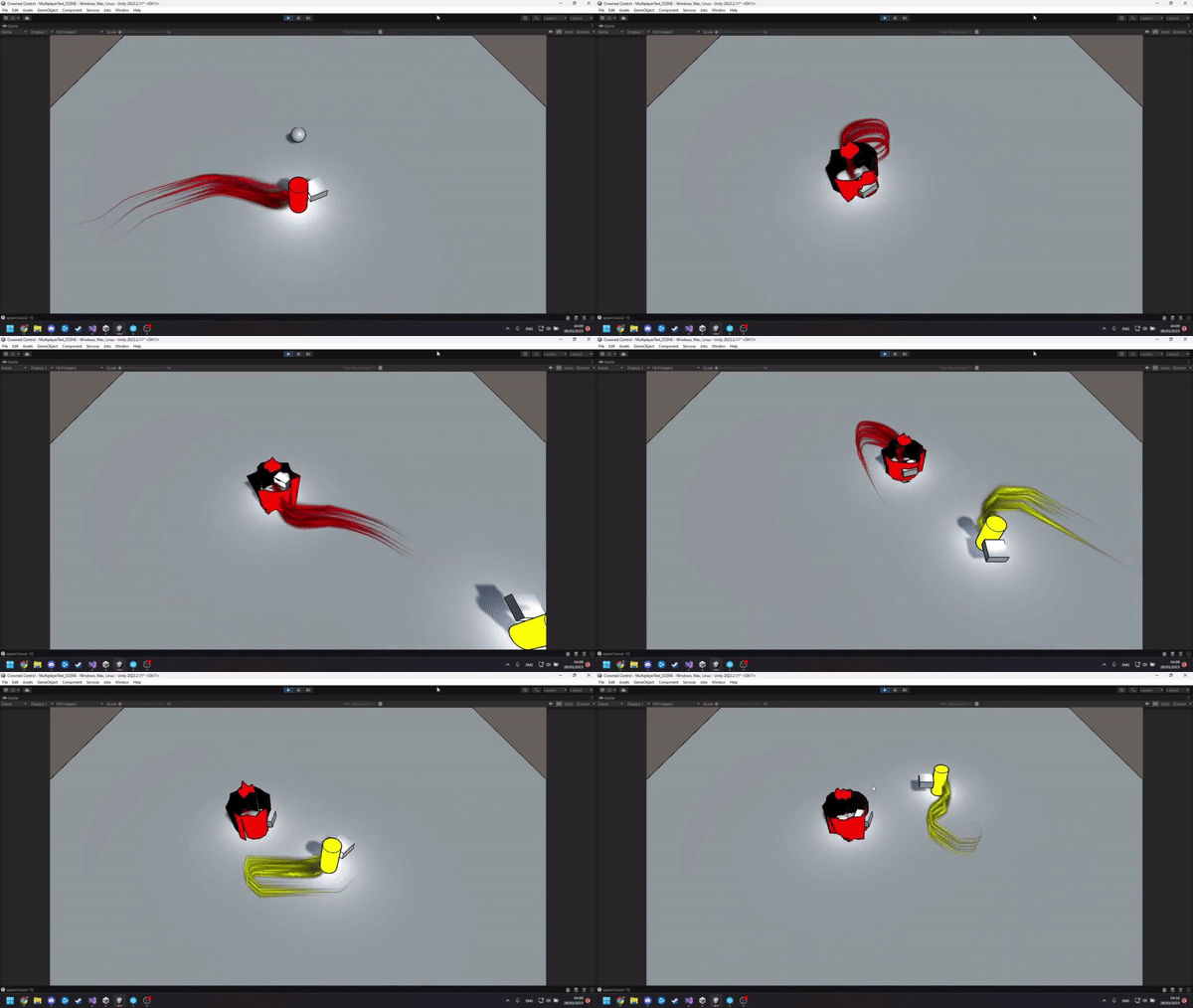
Lastly, items! These are our programmer’s personal pride and joy to work on. We're building an easy framework so that new items can simply call a few functions on the player interacting with them, without needing a whole custom implementation for each new item. It's based on the "subclass sandbox" design pattern, for those of you who would know it. Below is an example of one of our items: the Ghost Pepper, allowing you to gain a temporary speed boost.
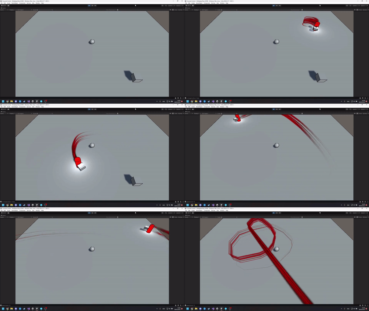
Next up: implementing traps, expanding our arsenal of items and most likely a whole load of unexpected bugs, but we'll tell you about those next week.
We'll also be giving the ghostly knight a little bit more variety to their gameplay, so stay tuned for that!
Sound Design
Programming
We took the time this week to make a full-fledged Sound Manager. We wanted to streamline the implementation process by having all the values needed for sound casters and audio clips visible in the editor.
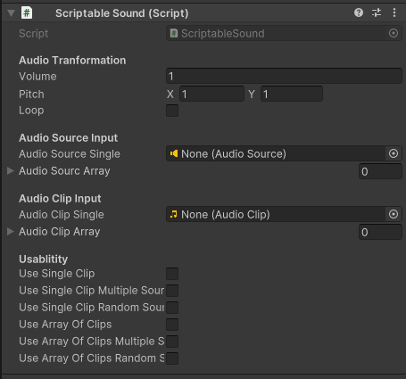
However during testing we ran into some issues that have yet to be fixed. Namely that there is no way for the Sound Manager to know which instance of the script is needed at which time. So it goes into a null pointer the moment it tries to access the script.
A fix is in the works, by assigning a name to the script and trying to access the values of the script that needs to be called.
Designing
While taking a break from the boring programming side of things, we also started with our first drafts of sound needed for the game. This week we made the Crown and Trap placements sounds, as these are some of the important aspects of our game.
For the Crown we wanted to make it sound like a magical item, as it has the power to change the player wearing it into a ghost. To achieve this we started by adding some wind chimes which has a down pitch of the same file on top of eachother and mixing it to sound like it's calling out to its next wearer. When the player loses the crown it teleports, so for this we took a low woosh with a hard bell sound which was again pitched down on top of eachother. Lastly, when picking up the crown you want it to feel powerful, so we started by taking a backpack sound and cutting off the low ends and then layering it with the same bell as the teleport but this time we offset the pitch from eachother.
Then we also made a placement sound for which we made 3 versions all made from the same starting file. We cut it up to start with the first hard strike of the placement. the second took the same file but reversed it and the last layered both on top of eachother.
Thanks for reading the Devlog, and we hope to see you next week!
Files
Get Crowned Control
Crowned Control
A game about teamwork, betrayal and knights
| Status | Released |
| Authors | gsteven, Aserbest, Mortepoule, Joren Dresselaers, dayellcolin |
| Genre | Action |
| Tags | Co-op, crown, knights, Low-poly, Multiplayer, party-game, Top-Down |
| Languages | English |
More posts
- Devlog #11: Polish Sprint – Week 2May 30, 2023
- Devlog #10: Polish Sprint – Week 1May 23, 2023
- Devlog #09: Production Sprint 2 – Week 3May 16, 2023
- Devlog #08: Production Sprint 2 – Week 2May 09, 2023
- Devlog #07: Production Sprint 2 – Week 1May 02, 2023
- Devlog #06: Production Sprint 1 – Week 3Apr 25, 2023
- Devlog #05: Production Sprint 1 – Week 2Apr 05, 2023
- Devlog #03: Game DesignMar 21, 2023
- Devlog #02: Prototype BuildMar 14, 2023
Leave a comment
Log in with itch.io to leave a comment.