Devlog #10: Polish Sprint – Week 1
Hello everyone!
This devlog marks the last stretch of work on Crowned Control. This week we've been polishing, meaning we've been improving both our code and visuals to create the best experience possible with what we have made during production. With a content block in place, we are not producing any new mechanics anymore to truly focus on improving what we have. So far our main focus has been improving the gameplay loop we've had in place, player feedback, our level's overall visuals and implementing menu screens.
Let's get into what changes have been made this past week!
Art
General Direction
This week we added some additional interaction feedback for several component. The players needed to really get some kind of confirmation regarding what happened. During previous week, the quality was perhaps way too suggestive and not explicit enough. For this reason multiple new effects were created.
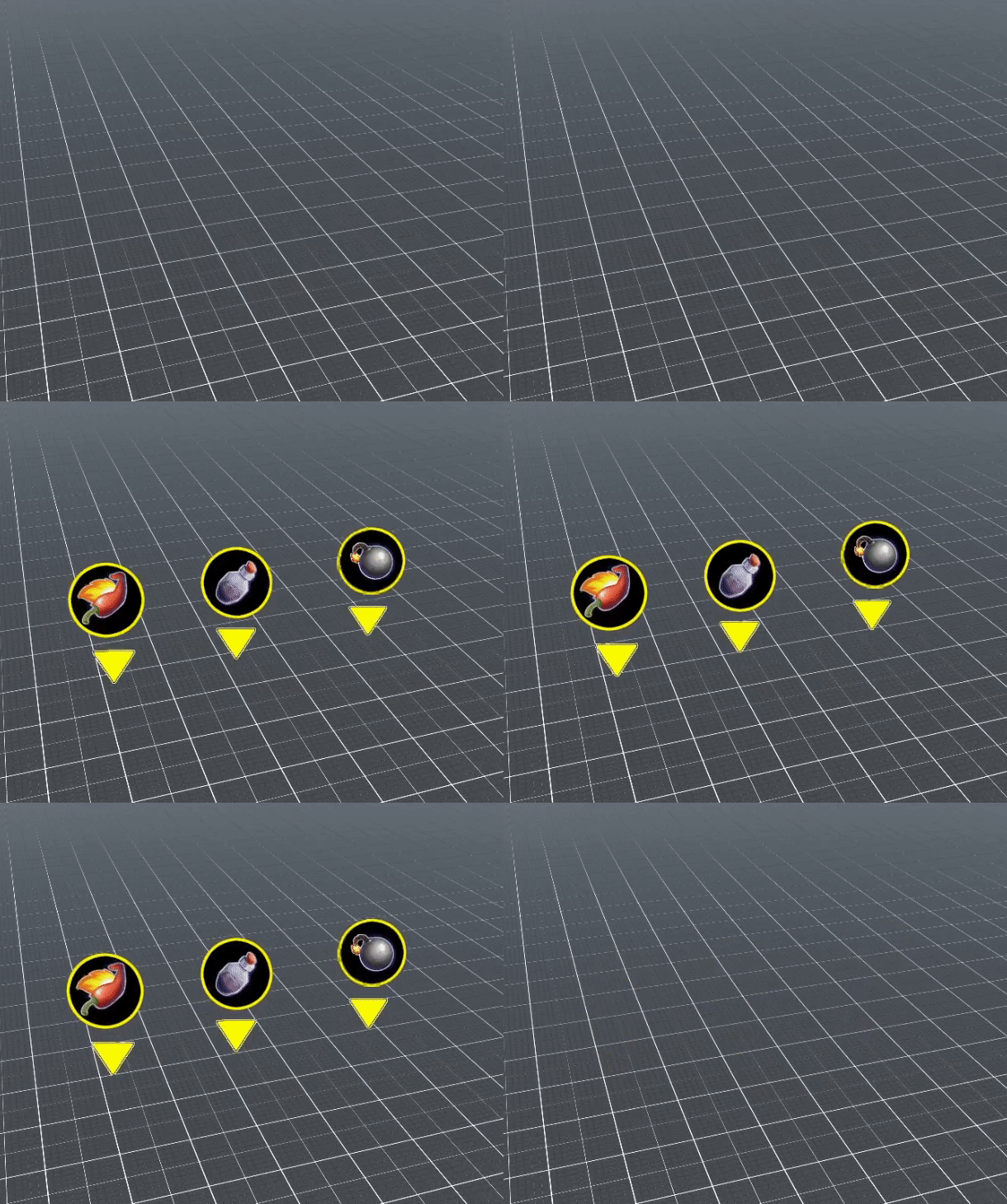
Chest Interaction
Our chests were seriously lacking the communication skill. The players simply weren’t aware that they actually received an item from it. We opted to make a sprite of the received item pop up once an item was picked up.
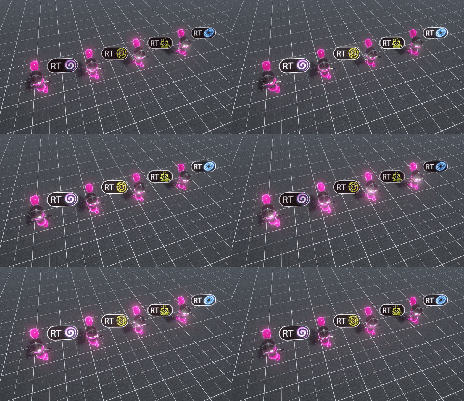
Ghost Abilities
During multiple test plays, we received the feedback that it wasn’t clear that the tooltips present next to the ghost player were depicting the available abilities. After various iterations, we came to the conclusion that perhaps one ability per ghost-transformation would be a more clear mechanic. This would also have the beneficial side effect that it enabled us to create a understandable tooltip.
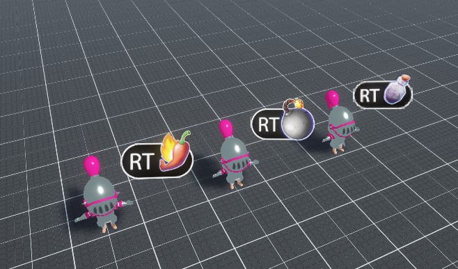
Knight Items
We decided to align the controls of the Ghost to the controls of the knights. The players would experience a much more clear and easy to understand transition into the Ghost mode of playing. The main focus of the change would be the state of mind and less the change of mechanical skills. The game’s true intention was expressed much better this way.
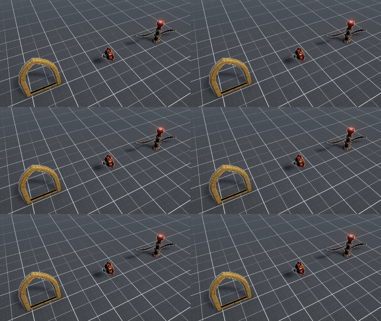
Highlighting Traps
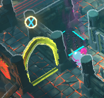
It became very clear that the traps needed much more readable indications regarding their existence and their functionality. Our current approach is to give the trap a bright emissive overlay in addition to the already implemented button tooltip. This way, there is no doubt what the mentioned tooltip is referring to.
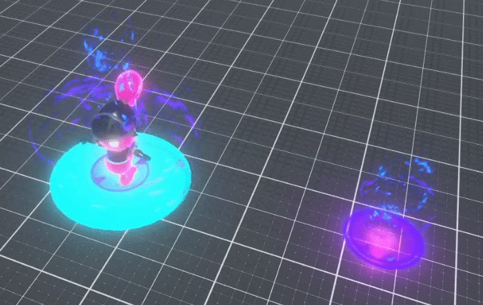
Ghost Power – Teleport
One of our most powerful ghost powers, namely the Portal, was simplified for the greater good of the game. Players could just teleport to the other side of the playground without any catch. It quickly became very clear that this was way too powerful. A restriction was applied to this ability by splitting it up into two phases. The first phase is the act of marking a destination. The second phase is the act of teleporting to that mark. This way, the other players have a means to counter the Ghost player’s teleportation, since the landing spot for the Ghost will be visible to all.
Range Indicators – Traps
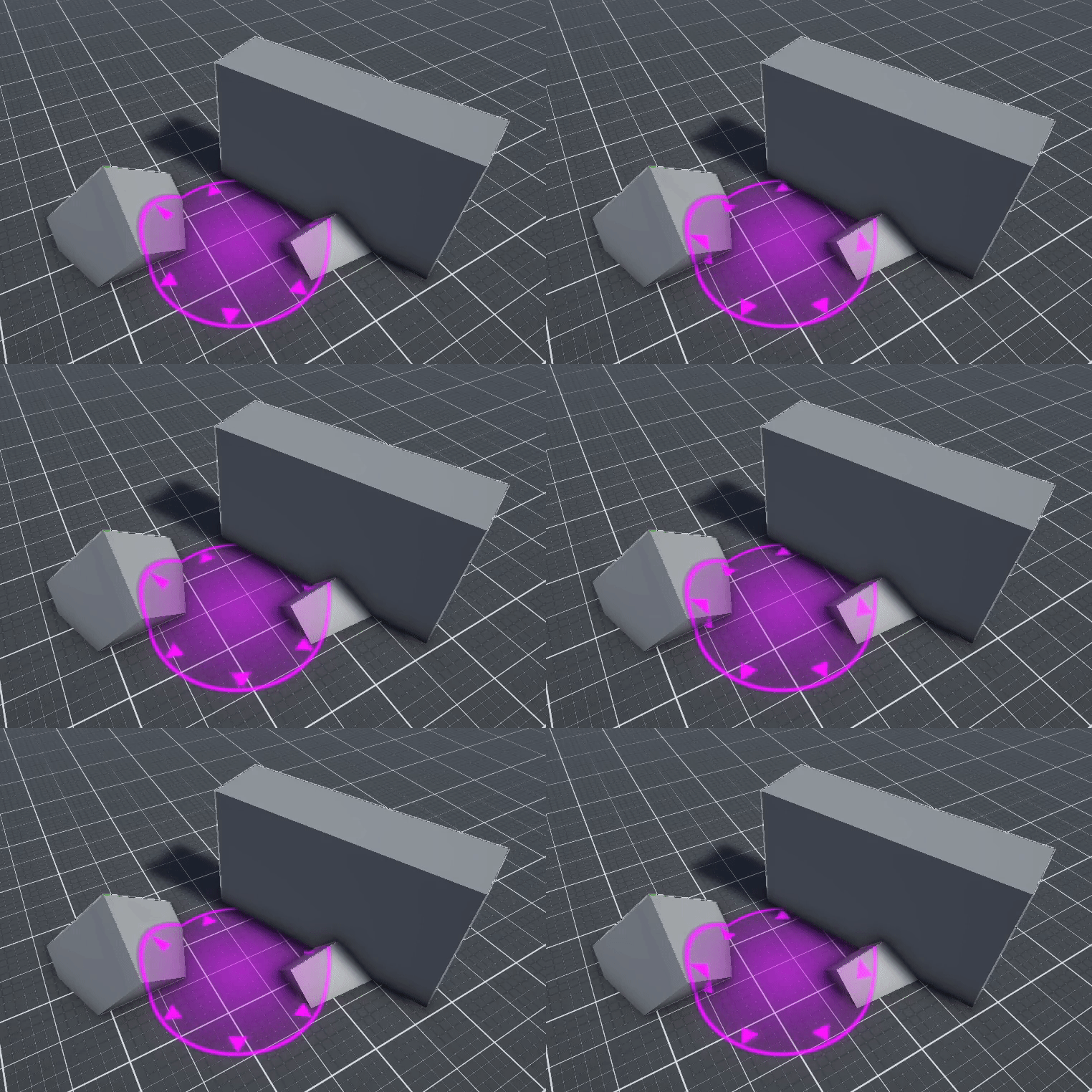
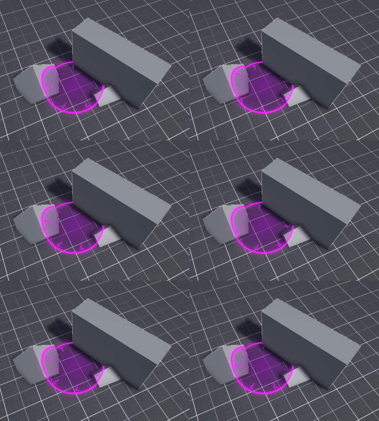
One of our traps had a notorious reputation for not being clear at all and absolutely a nightmare for trying using it to your advantage. We decided to give a make-over to our Rotating Blades trap by implementing the different colour phase mechanic to it as well. Additionally, a range indicator was used to convey the state of the trap.

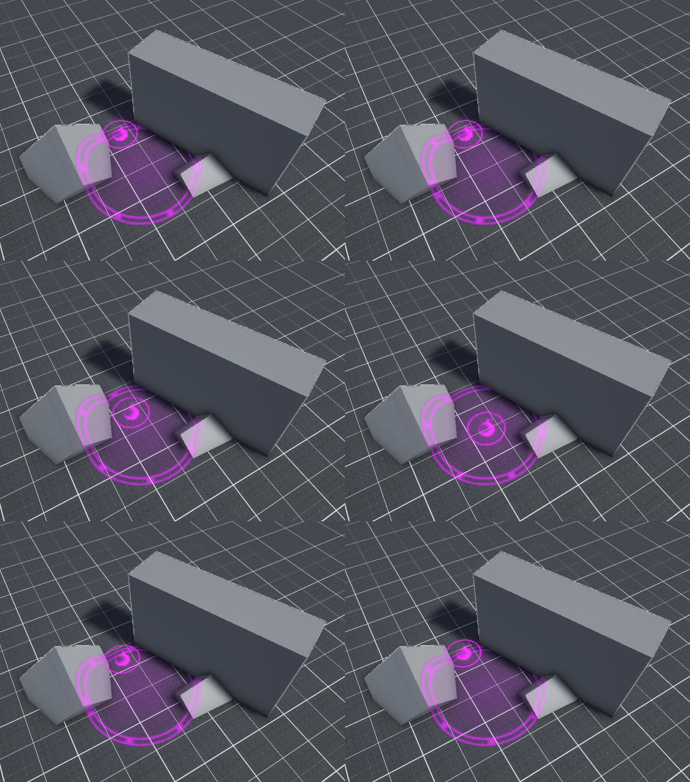
Range Indicators – Ghost Powers and Knight Items
Some of our power-ups were not always as clear regarding their reach. We tried to solve this issue by manifesting the actual range of the power-ups. The readability and immersion into the game should be improved by taking this step.
Character Selection
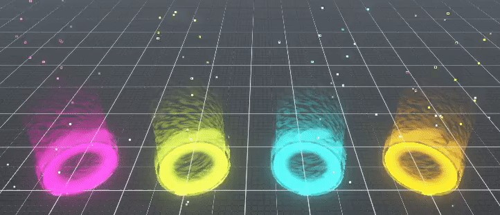
Visual cues are implemented even to the part before the actual gameplay. During the character selection screen, two distinct effects will be used to either depict the absence of a player or the presence of a player. The latter will be expressed by using a vibrant effect around the present player character. The available spots however will be visualized by a relatively calm effect, but with a button tooltip hovering above the spot that a new player can take in.

UI
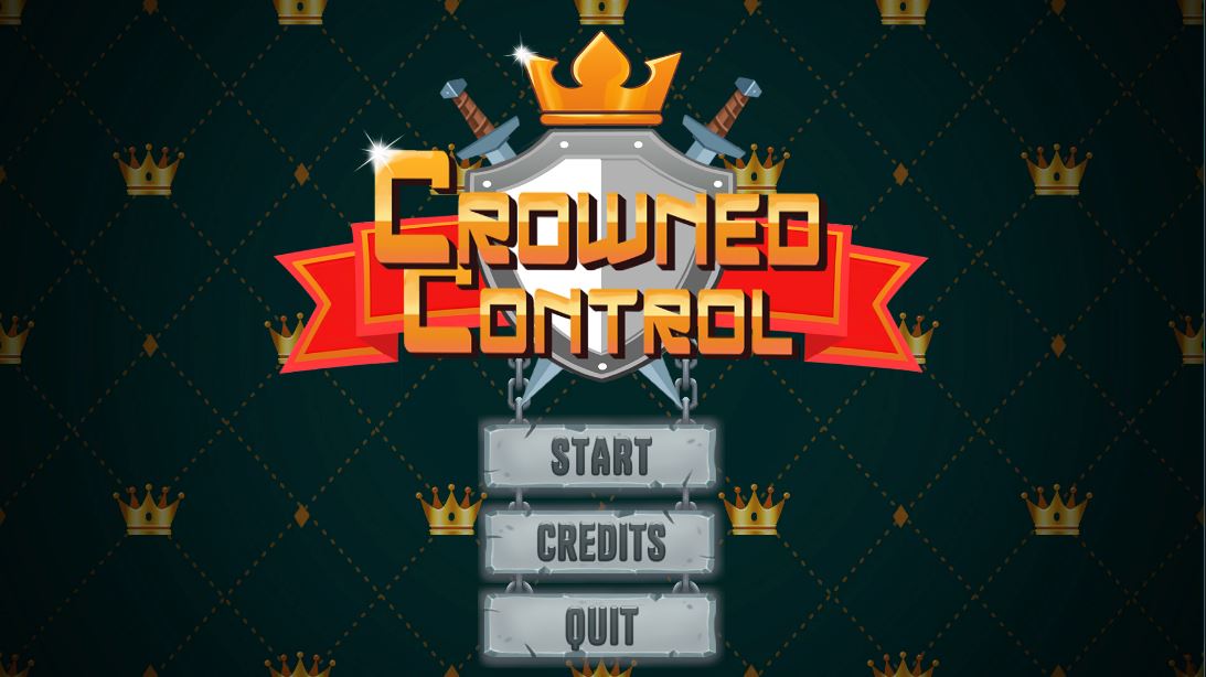
We have been working on finalizing our menu screens this week. Although the menus aren't fully implemented in our game yet, we can show what the intention of the menu screens will be below
Starting screen:
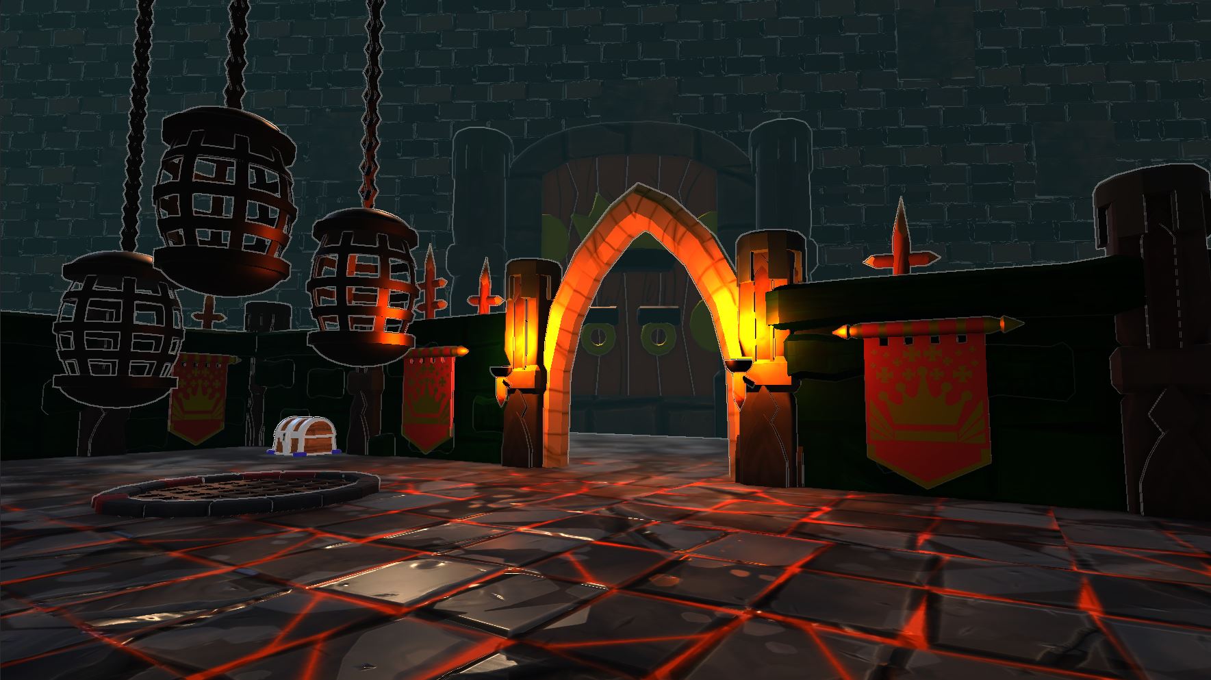
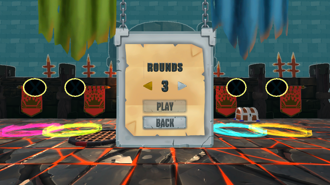
Character selection screen background:
Here you will be able to join the game and determine how many rounds will be played.
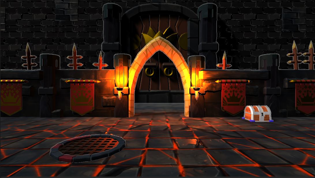
This visual will appear before every round, making it more clear that the objective is to get the crown.

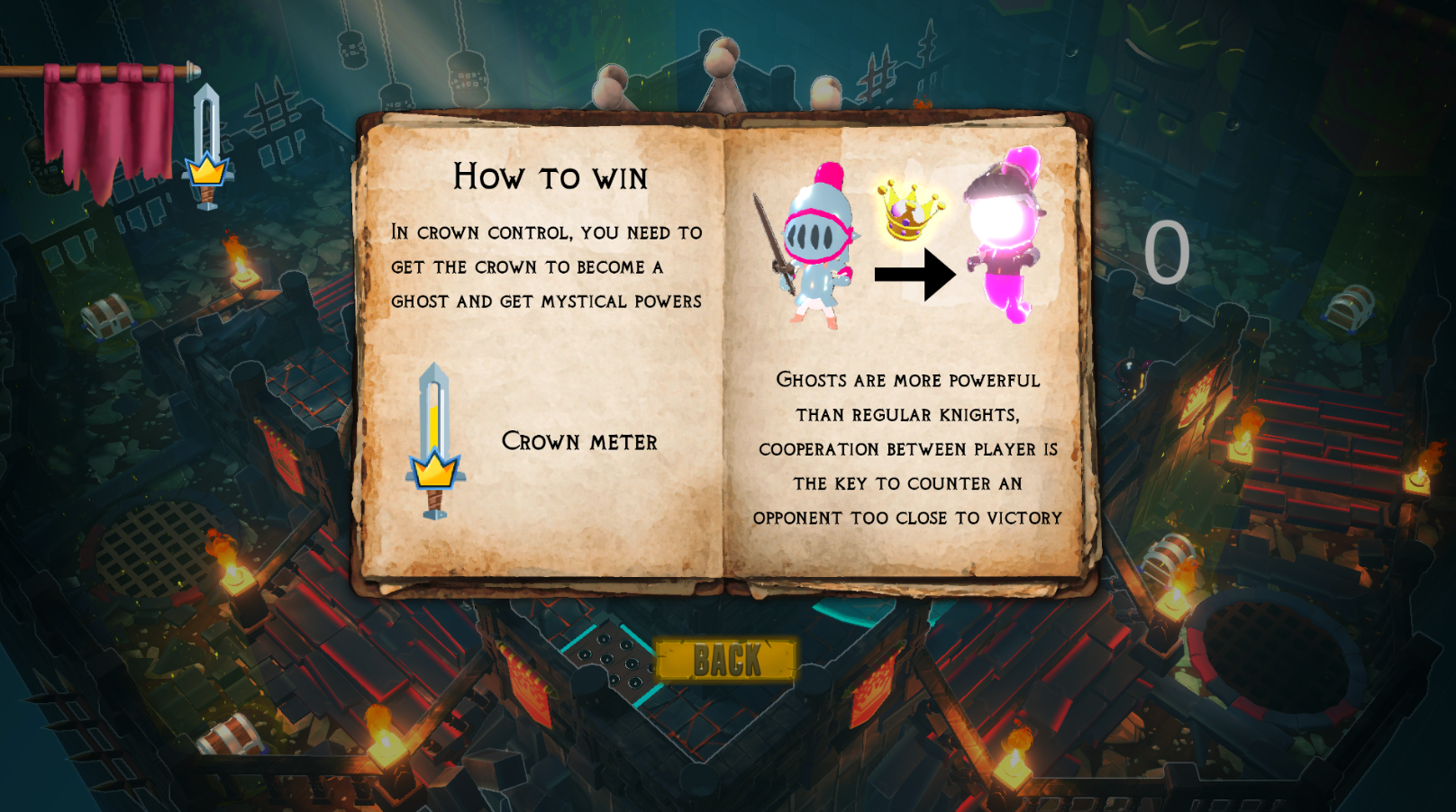
We have created a game guide which can be accessed by pausing the game. This gives a brief overview of our game's mechanics and controls.
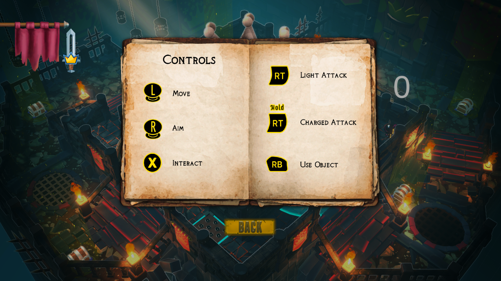
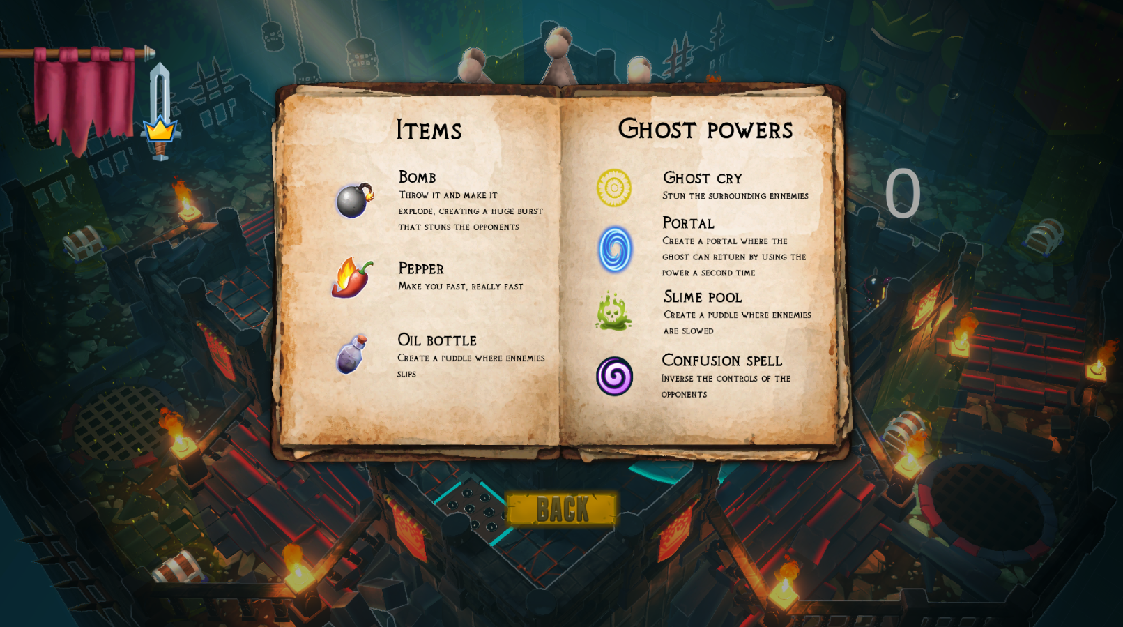
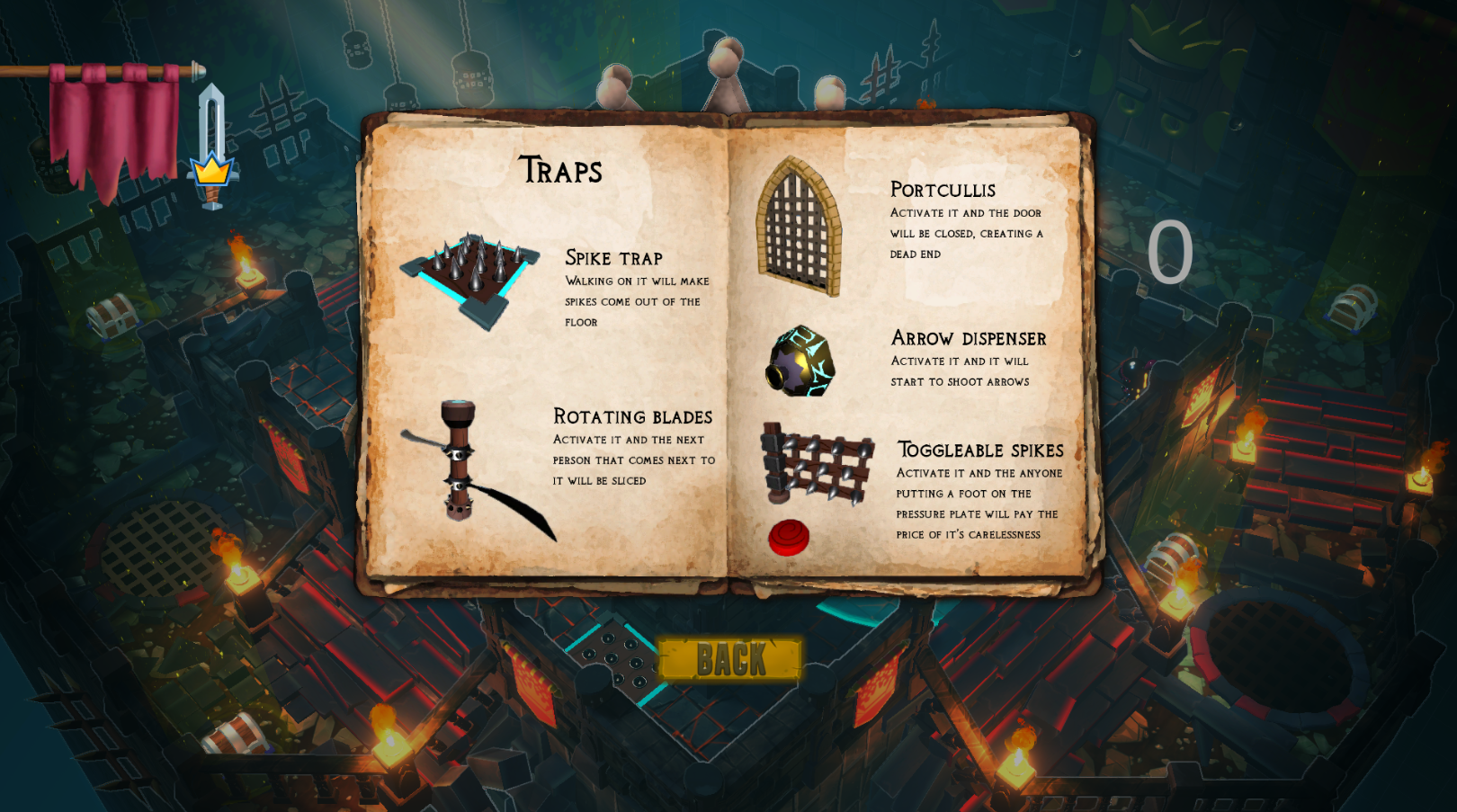
After every round, the winner will get an effect clearly showing who has won. This will be accompanied by a score of how many rounds each player has won.
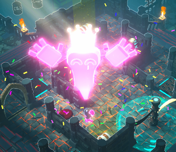
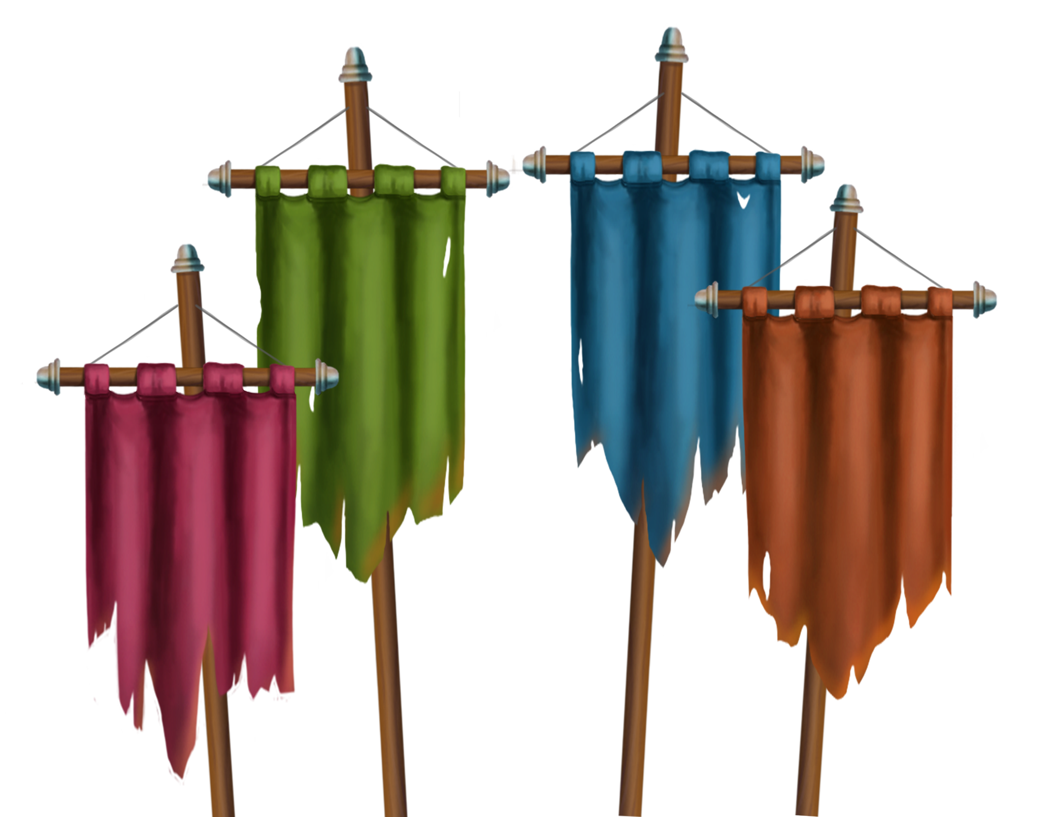
The end screen will show which player has won and the statistics of how long everyone has held the crown.
Programming
This week was mostly focused around UI, our main menu is close to finished, with subsequent menus nearing completion as well.
We also implemented the interaction highlighting shown before, making it easier than ever to see which traps are about to be activated!
The end of a round received some love too, the winner now gives off a cheer and confetti flies out when they do so!

Apart from all that, we noticed that the ghost was way too powerful compared to the knights, so we toned down its abilities to a single use per 'cycle'. This should make games more strategic for the ghost, and overall more fun for everyone.

See you next week for our last Devlog!
Files
Get Crowned Control
Crowned Control
A game about teamwork, betrayal and knights
| Status | Released |
| Authors | gsteven, Aserbest, Mortepoule, Joren Dresselaers, dayellcolin |
| Genre | Action |
| Tags | Co-op, crown, knights, Low-poly, Multiplayer, party-game, Top-Down |
| Languages | English |
More posts
- Devlog #11: Polish Sprint – Week 2May 30, 2023
- Devlog #09: Production Sprint 2 – Week 3May 16, 2023
- Devlog #08: Production Sprint 2 – Week 2May 09, 2023
- Devlog #07: Production Sprint 2 – Week 1May 02, 2023
- Devlog #06: Production Sprint 1 – Week 3Apr 25, 2023
- Devlog #05: Production Sprint 1 – Week 2Apr 05, 2023
- Devlog #04: Production Sprint 1 – Week 1Mar 28, 2023
- Devlog #03: Game DesignMar 21, 2023
- Devlog #02: Prototype BuildMar 14, 2023
Leave a comment
Log in with itch.io to leave a comment.