Devlog #07: Production Sprint 2 – Week 1
Welcome to week 7 of our devlog for Crowned Control!
With only 3 more weeks of production to go, we sat together this week and decided on what needs to be done to complete our game.
We have decided to overhaul certain elements that we had originally planned to put more focus on the mechanics that were already in play.
With that our biggest changes as of now include removing a lot of additional item, trap and attack mechanics, since these would clutter our game too much. We’ve also streamlined the combat mechanics and made it easier to obtain and loose the crown.
Art
Lighting and Level
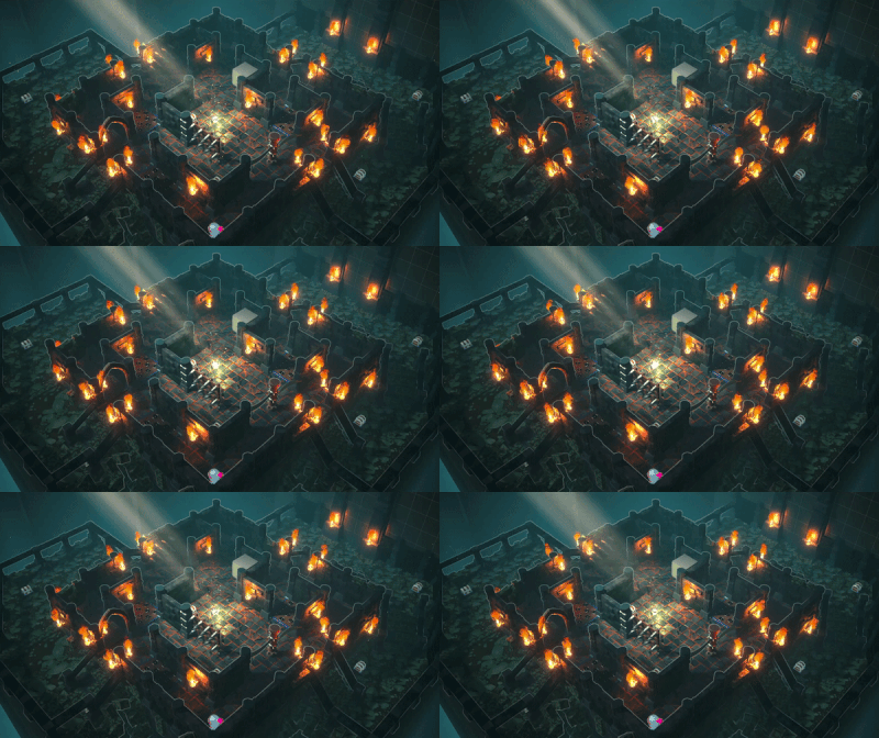
This week we worked on post-processing the level. The contrast of the level has been adjusted with the help of a vignette as well as more light in the centre of the level. The torches have been upgraded by adding a brighter centre particle as well.
On top of this, small level adjustments have been made: the left platform has been raised to avoid very steep stairs, some walls have been broken down to improve visibility, more torches and traps have been added and we finally have some chests in our level to keep our items in.
Shaders and RFX
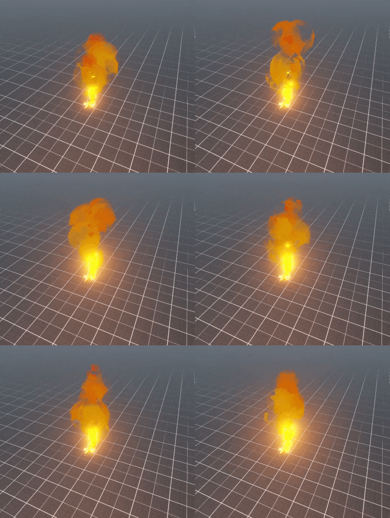
Adding Core Flame
Our torch flame effect lacked a solid emissive core component. A flame kernel was added to really get the convincing feeling of an actual flame functioning like a torch. This new version also seems to suit the actual lighting on the walls.
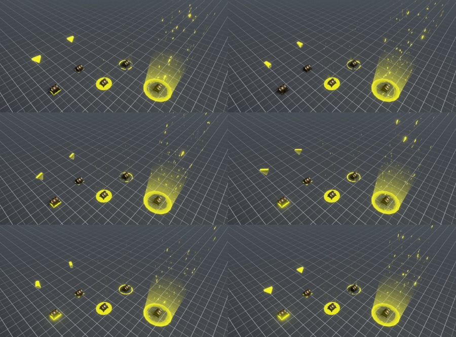
Chest Highlighting
The chests from which the players can attain some cool items didn’t seem to pop out enough. To really emphasize the importance of the chests, an additional highlighting was attached to these chest meshes. Several iterations were generated to test out which would suit the best for our level’s needs.
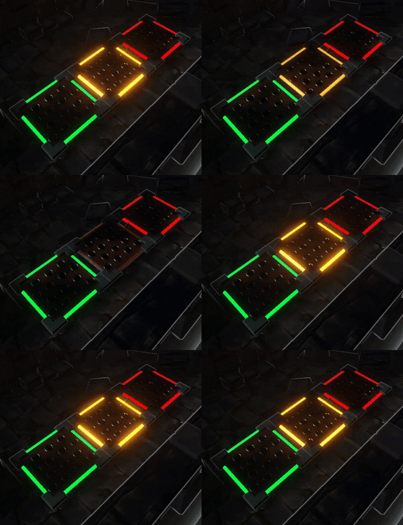
Trap Trigger Telegraphing
It became clear that the players really needed to be made clear what was going on without generating any doubt. The player should be able to immediately understand when a trap is triggered and in which phase of the trap’s activation cycle the trap currently is. We decided to make a different colours for each of the phases, namely the idle phase, the transition state from idle to execution and the execution phase. These colours would respectively be static green, flickering orange and static red.

Interaction Tooltip
The players should be made aware when a certain feature is triggerable. Our group decided to actually give the player feedback on screen during gameplay instead of just explaining it with additional separate text. This way the players would immediately know what to do in a very user-friendly fashion.
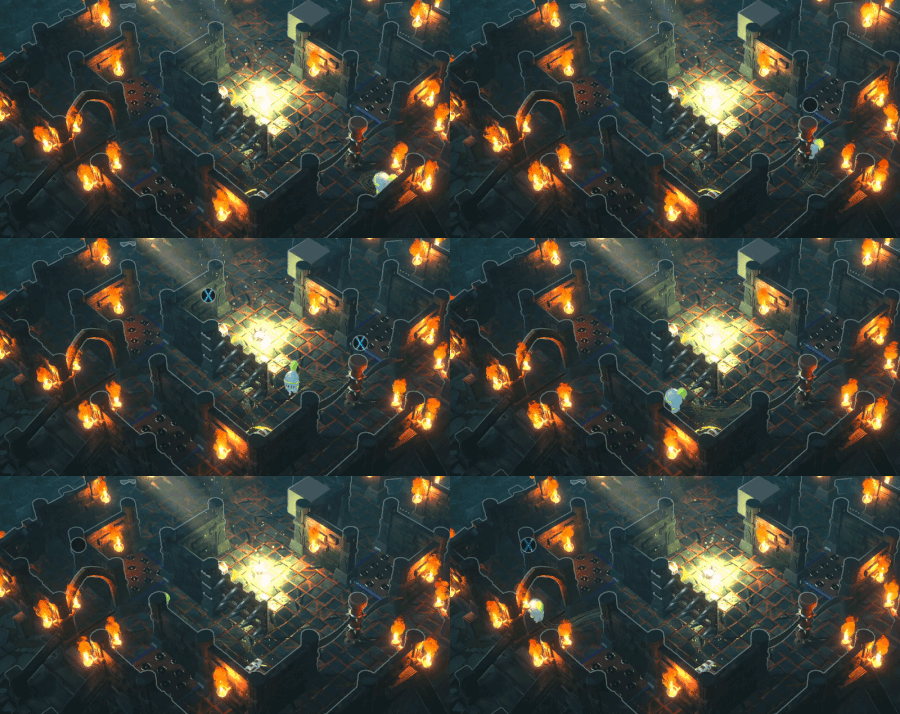
Player Status - Highest Score
Currently there is a debate regarding how we would be able to make clear to all the players who the player with the highest score is. Just like with the trap trigger tooltip, we really wish to implement this in an organic way. At the moment, a subtle white light shaft is chosen as the solution, but the odds are really great that this will probably be altered since there are a lot of other light beam resembling effects. In the end, the player’s comfort and readability should not be sacrificed in any way.

Programming
This week was mostly spent working on traps. We added some new ones like the portcullis and arrow trap and created two new items as well, the confusion spell and a bomb.
Firstly, the portcullis is a trap that will let you block of pathways of the dungeon, by slamming the gates shut!
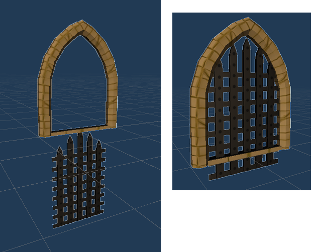
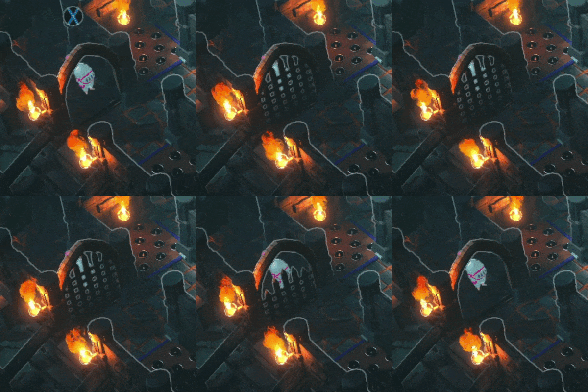
Next up, the arrow trap will periodically fire arrows in a straight line, hopefully catching your fellow knights and stunning them briefly.
Behind the scenes we also implemented a system to randomly spawn a set amount of traps in the scene, which randomises each round. This should provide some more replayability and unpredictability to the game.
Item-wise, the confusion spell reverses the controls of any unfortunate souls who enter its area of effect. This will be a great tool to, well, confuse your opponents! Secondly, the knights can now find bombs inside our treasure chests. Luckily these bombs only seem to stun the affected knights, so missing limbs should be of no concern.
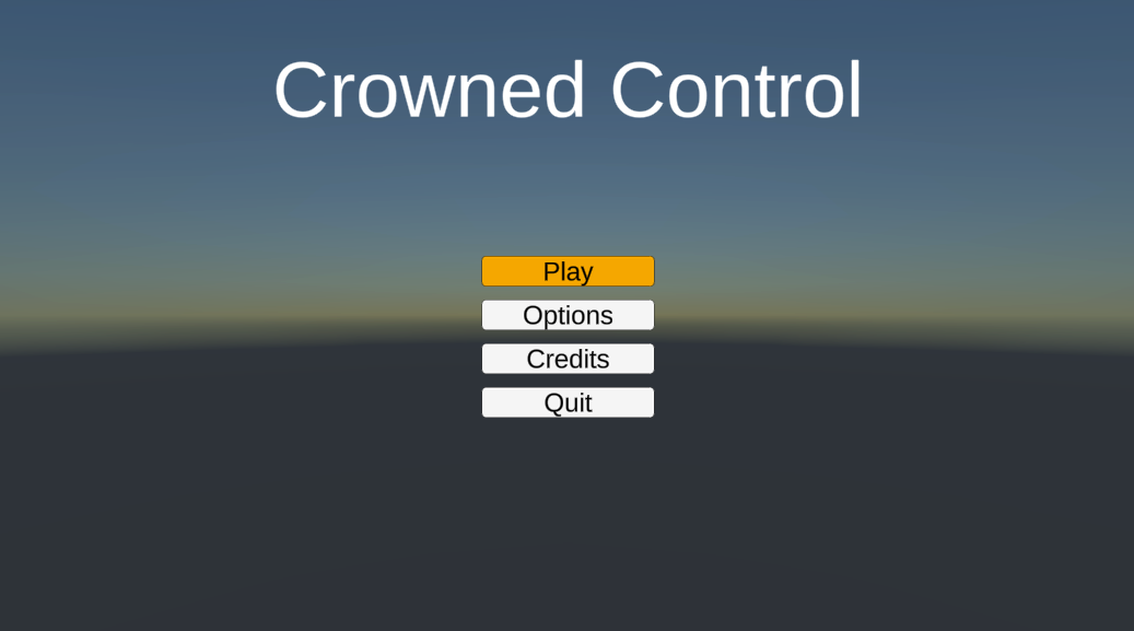
Apart from gameplay, we also spent time working on a main menu, which is very much unfinished for now. The most important part of this menu is that it should be accessible via controller, something that we found a lot easier to do than we expected.
Sound Design
This week not a lot of audio was done, as we spend time trying to get our animator to work. We did add some music too, so the game feels more alive and battle ready.
Back to animations, we got the basic animator to work after long hours of head scratching and are only missing our attack animations to get a full scope of the motions. We made humanoid rigs out of our players and changed the animations to humanoid as well, this means that, as long as the player rig is set to humanoid and the correct avatar is linked, we can now link any animation and it will correctly scale to the player rig we have going on.
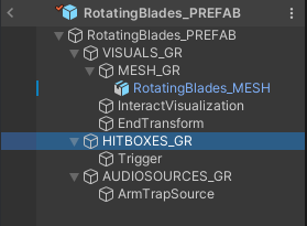
We also spend time getting our folder structure in order. As you can see here we made grave effort to name all object groups, so they clearly indicate what they are needed for.
Thank you for reading this week’s devlog, we hope to see you next week!
Get Crowned Control
Crowned Control
A game about teamwork, betrayal and knights
| Status | Released |
| Authors | gsteven, Aserbest, Mortepoule, Joren Dresselaers, dayellcolin |
| Genre | Action |
| Tags | Co-op, crown, knights, Low-poly, Multiplayer, party-game, Top-Down |
| Languages | English |
More posts
- Devlog #11: Polish Sprint – Week 2May 30, 2023
- Devlog #10: Polish Sprint – Week 1May 23, 2023
- Devlog #09: Production Sprint 2 – Week 3May 16, 2023
- Devlog #08: Production Sprint 2 – Week 2May 09, 2023
- Devlog #06: Production Sprint 1 – Week 3Apr 25, 2023
- Devlog #05: Production Sprint 1 – Week 2Apr 05, 2023
- Devlog #04: Production Sprint 1 – Week 1Mar 28, 2023
- Devlog #03: Game DesignMar 21, 2023
- Devlog #02: Prototype BuildMar 14, 2023
Leave a comment
Log in with itch.io to leave a comment.