Devlog #06: Production Sprint 1 – Week 3
We have reached the final week of the first Production sprint and we would like to show you what we have been working on so far. The goal for us for this first sprint was to get the most high priority aspects of our game in there. That way we have a playable game and we don’t have to worry about critical aspects when we want to start finetuning and polishing things at a later stage.
Art
This week our team has been mainly focusing on finishing up the models, shaders and FX we really wanted to get in the game. This includes some core traps, the knights’ weapons, lighting FX as well as finetuning our outline shader. It was nice to see that all the work we had done over the past few weeks came together and gave a beautiful result. We have been pretty well on track with completing our dedicated tasks that we had planned for the first sprint, so now we will evaluate again how to proceed with the game process and which tasks to include in our next production sprint so that we can meet our deadline on time.
Lighting and Level
Lighting
This past week we finally got around to properly lighting our level. The ambient lighting creates a blue hue over our level, making the shadows and background of our scene blue and gloomy. The main light is warmer in color and focuses the attention on the center of the level. Torches were added with the fire FX to add some warmth and visibility to our scene. We also created some particles for the god rays, highlighting the center of our scene once more as well as the crown that is placed in the center.
Blockout
We applied some feedback this week regarding the layout of our scene. We made sure it is not possible anymore to walk off-screen and we created some more height differences between the lower and upper level so the stairs aren't as steep.
Blockout Texturing
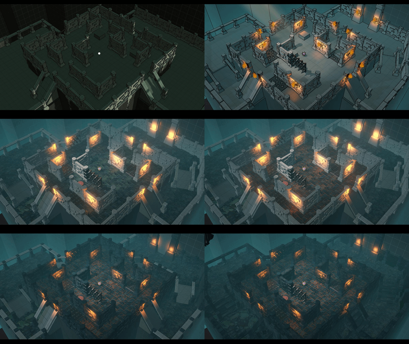
Once the major shapes and proportions had solid foundation, the texturing process started while keeping in mind the values perceived on the gameplay screen. Two texture maps were used in a variety of ways to make the most of the texture maps and to keep a colour consistency as well. Some focal points received a slightly different colour shift due to respecting our art bible. Harsh straight laser cut edges were resolved with a minimal amount of low poly meshes on which one of the used texture maps were applied with some UV-shift and tiling tweaks.
Shaders and RFX
Outline Generator Revisited
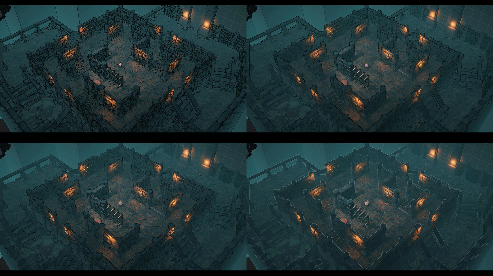
Our outline generator had some major problems in context of nuanced controls. The readability of the gameplay screen suffered drastically because of this. It became quite important to solve this issue as quickly as possible. A new shader was created with quite a few improvements. This newer version now has the ability to check in 8 directions instead of only 4 directions (in context of the pixels adjacent to the rendered pixel on screen). Colour as an influencing factor is temporarily removed from the new setup due to it causing too much visual noise. Only depth and normal related data are taken into account when calculating the outlines. Additionally, separate controls over both of these two factors are made possible as well. Another new feature is the possibility to make use of the data of the scene depth in order to convert it to a grayscale mask and even tweak its values and contrast. This allows us to soften the harshness of the more far off pixels and give the closer elements the appropriate intensity of outlines. Last but not least, the colours of the outlines can be blended with the already present colours on the gameplay screen, which can potentially result in a softer more appeasing end result.
Player Light Beams
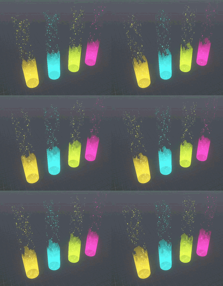
Occasionally, players might get out of our sight behind a wall or other sight obstructing surfaces. To counter this, a light shaft is implemented to the players. How exactly this effect will be implemented will probably be determined through trial-and-error. The foundation however is well built and the parameters of the shaders related to this effect are easy to control. In other words, the iterations in future weeks will go a lot smoother and a lot more time can be spent to polishing the effect.
Readability of the Main Objective
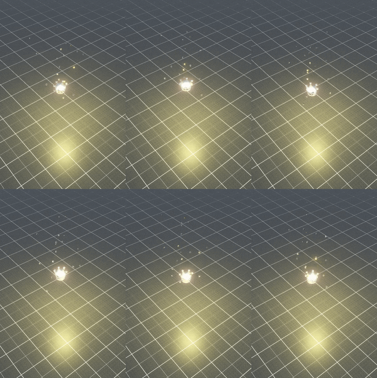
The whole game revolves around getting the crown. We did our best to achieve great readability regarding this matter. Whenever players enter the arena, there won’t be any doubt where they need to go. The bright shiny object in the midst of a dark and cold environment should be able to tell it all without the use of any words.
Player Status - Stunned
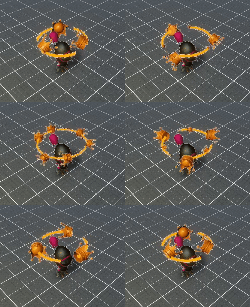
The knights that get stunned will suddenly be unable to move at all. We went through the gameplay already quite a few times and it really became clear to us that the player needs all the visual confirmations possible. We opted to use RFX to convey the message that the player is under the influence of some kind of positive or negative effect. For the state of being stunned, the player will get flying crowns orbiting the player character’s head.
Player Status - Slowed
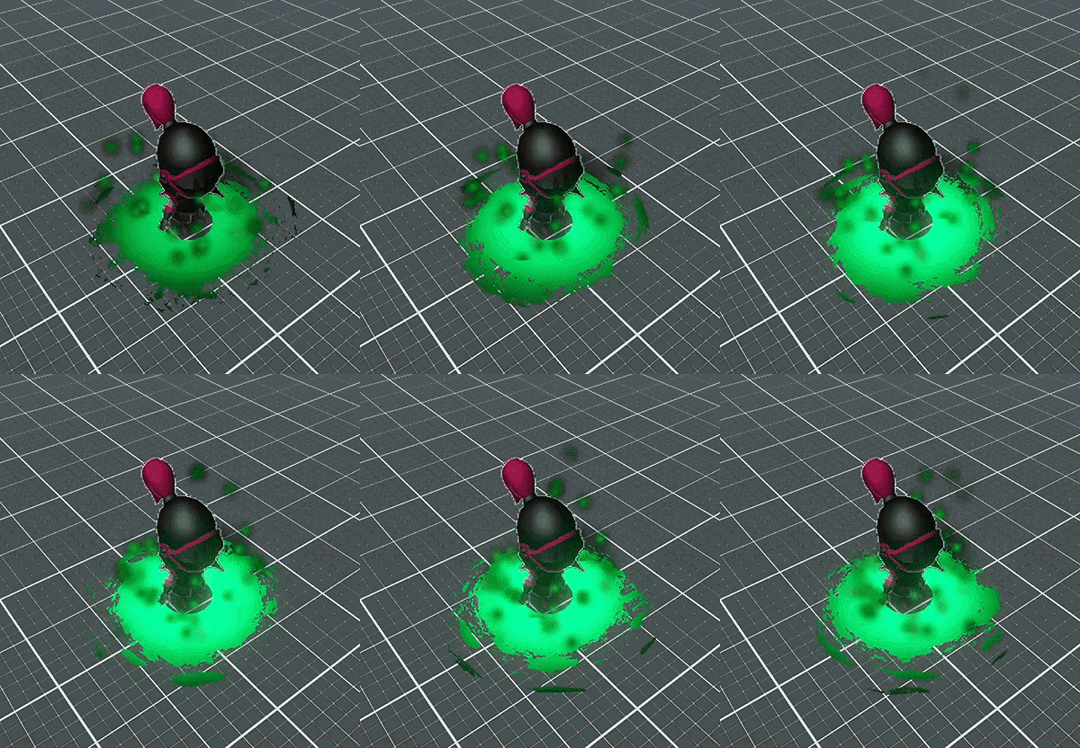
One of the other notorious negative influences the knight can undergo during gameplay is the slowing effect of the slime pool. Once a player runs over one of these, their movement speed drops mercilessly. Just like the previously mentioned state of being stunned, the state of being slowed is a state worthy of being addressed to the player with proper visual cues.
Crown Counter
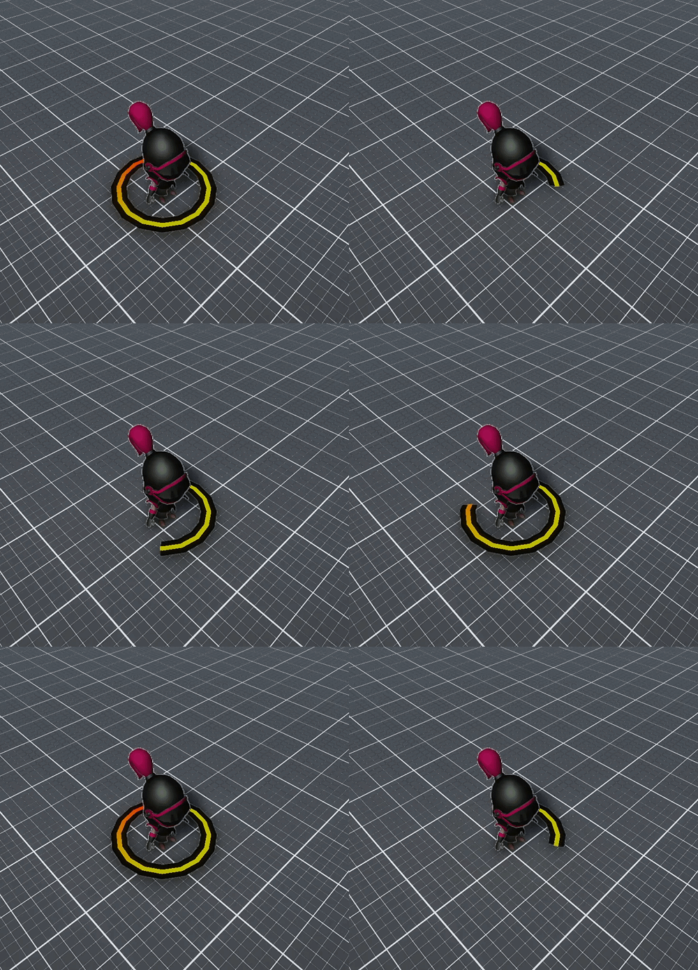
Players should be able to tell who has accumulated how many points at any point of the game. This is crucial to determine the strategy one will execute during gameplay. We are currently convinced that besides the use of a corner UI that depicts the score, some kind of gizmo attached to the player character should tell all players the current state of crown score. The base mechanics are finished. The developer user has to enter the time limit in one of the parameters and the gauge will fill accordingly.
Modelling
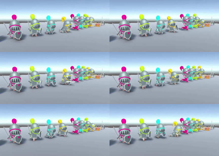
The weapons for the knight have finally been modelled and added to the animations. We now have a couple of base animations for the knights and ghosts, but more will be added in the next sprint. For example, we still need animations for running sideways, backwards, animations for the heavy attack, for throwing, for getting hit, for dying, and so on, and so forth.
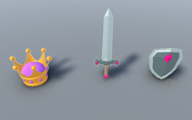
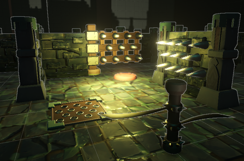
We have also been working on implementing our textures of the interactive objects now that we have a light setup. The goals is to make the traps and items as readable as possible from our top-down camera angle.
Programming
This week we spent mostly focusing on implementing more traps and items. Last week we showed off the ground spikes, which stun players who collide with it. Now we simply had to make more variations, the simplest of which was the static wall spike trap, which doesn't move at all
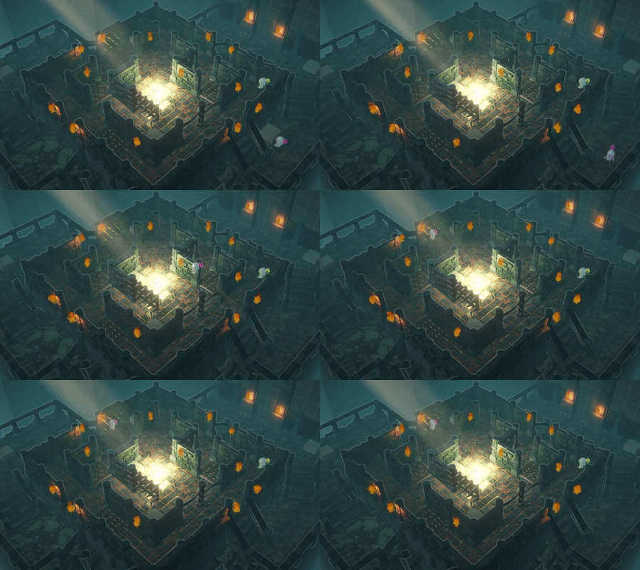
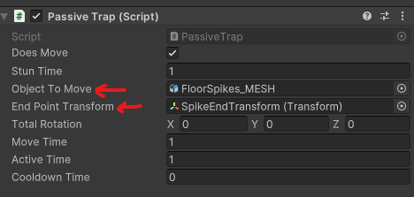
This was simple enough to do once we had our basic trap classes set up, the harder ones would be the traps with rotating parts. As a quick recap, we implemented last week's moving traps via a rather versatile script. In which we can simply hook up a moving part of the trap, give it a Transform component of where it should go, tell the trap how long that should take et voila, everything happens as it should! (A Transform component essentially contains a whole set of position, rotation and scale values, which allows us to easily pre-determine a final location).
With that in place, we now had to create the toggleable traps. These proved to indeed be a bit harder as they also required rotating parts. Firstly, we tried the same approach, rotate the mesh depending on the Transform component we tell it to go to. Turns out, that's not doable for rotations over 360 degrees. This is due to rotations in Unity being handled through quaternions, which are vastly out of scope of this dev log. The important part is that we had to find a different way of doing our rotations. This was, luckily, an easy fix. We simply give the rotation as a vector and reference that!
At the end of all this, we finally had functional traps!
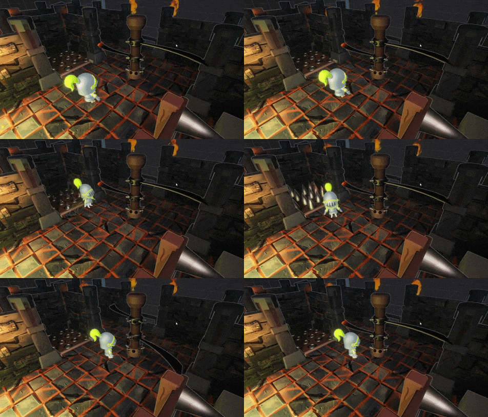
Next up, we implemented a new ghost ability, which we call the Slime Pool. It functions very similarly to the Knight's Oil Flask item, but with a more ghastly colour and an added cooldown instead of being deleted on use.
While on the topic of our Ghostly Knight, they will now have a new advantage over the Knights by gaining an increased speed, depending on the amount of adversaries they have to face.
Lastly, while testing some ways we could make the crown feel more dynamic than simply being dropped to the floor, we stumbled on this.
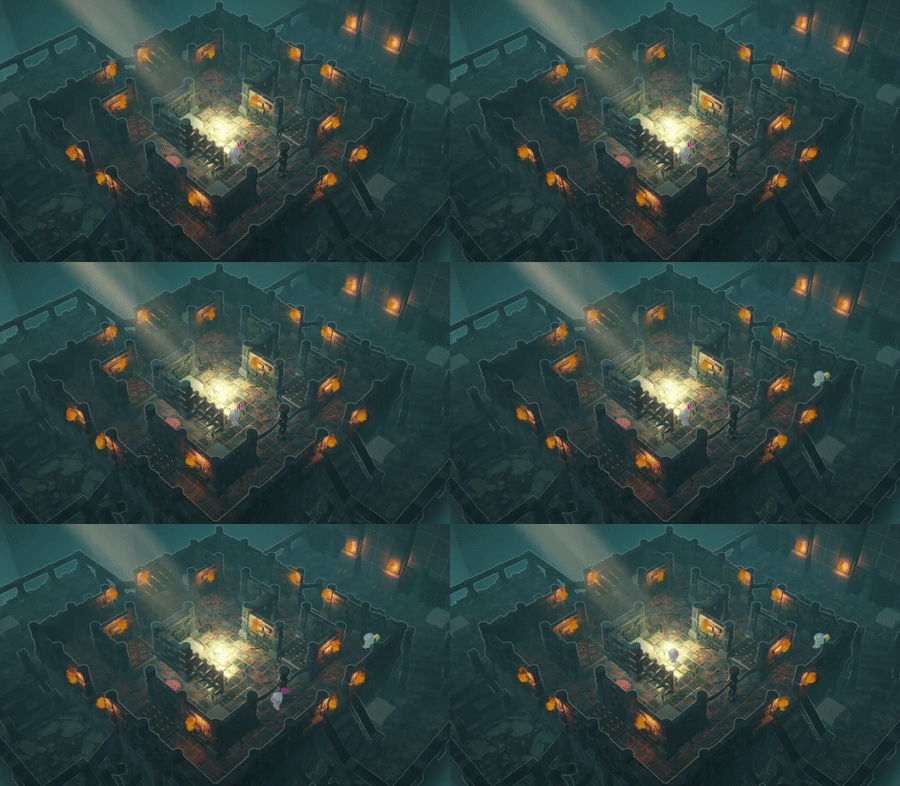
Which we decided was definitely a feature, and not a bug at all. So we refined it, gave it some nice variables to control the speed and added it to the game! This means that the crown will now move towards the center of the map if it is not picked up quickly enough, ready to start a new chase.
Animation
This week we wanted to get our animations to work as seen in the upper parts of the devlog. Sadly, after many hours of work we came to the conclusion that we had messed up the rig of out player character and will have to redo this one.
Although our rig didnt work, we did already set up our character controller using mixamo animations and running these as humanoid characters.
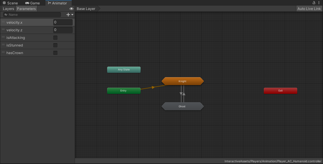
A default animation was made that plays for the knight whenever the player is spawned in the scene, and once a player has the crown move into the ghost form and switch up the animations.

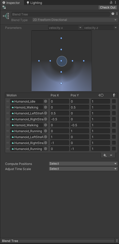
The player animations work by having a central blend tree going over the locomotions the player can perform, from standing still (idle), walking, strafing and running.
When the player would get hit it, the tree will go into the stunned state and perform the dizzy animation, and when the player is not dizzy and performs an attack, the attack animation will be played.
Sound Design
Programming
When adding more sounds to the game we came to a conclusion that we were missing the playOneShot function on audio, so improvement time!
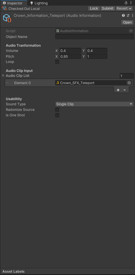
We added a new fancy button to the usablity of the audioInformation that plays the sound as a one shot and avoids overlapping audio.
In other words we needed to change up the informations because we ran into a lot of bugs, namely sound overlapping every frame or double calls of one effect, aka the sword slash.
The other reason for the bugs were faulty code and incorrect sharing over perforce.
Design
This week the game came together and so did the sound, in retrospect we came to the conclusion that it could get a bit too noisy, so we decided to cut back on the detail each sound has and make a more simple and streamlined experience for the players.
With a less dense environment, we make it possible for every individual sound to be respected in their world.
Up next is the start of the second production sprint. We'll be working hard to have a fun game for you to play!
Till next time!
Files
Get Crowned Control
Crowned Control
A game about teamwork, betrayal and knights
| Status | Released |
| Authors | gsteven, Aserbest, Mortepoule, Joren Dresselaers, dayellcolin |
| Genre | Action |
| Tags | Co-op, crown, knights, Low-poly, Multiplayer, party-game, Top-Down |
| Languages | English |
More posts
- Devlog #11: Polish Sprint – Week 2May 30, 2023
- Devlog #10: Polish Sprint – Week 1May 23, 2023
- Devlog #09: Production Sprint 2 – Week 3May 16, 2023
- Devlog #08: Production Sprint 2 – Week 2May 09, 2023
- Devlog #07: Production Sprint 2 – Week 1May 02, 2023
- Devlog #05: Production Sprint 1 – Week 2Apr 05, 2023
- Devlog #04: Production Sprint 1 – Week 1Mar 28, 2023
- Devlog #03: Game DesignMar 21, 2023
- Devlog #02: Prototype BuildMar 14, 2023
Leave a comment
Log in with itch.io to leave a comment.