Devlog #08: Production Sprint 2 – Week 2
Hey everyone! We are back for another update this week!
We're in the middle of our second production sprint this week and the game is really nearing it's final form. We have been spending a lot of time on UI art and UI programming as well as implementing a lot of our RFX and streamlining the present mechanics and a little more modelling work for to make our background come together. Let's have a look!
Art
Increasing the Level of Immersion
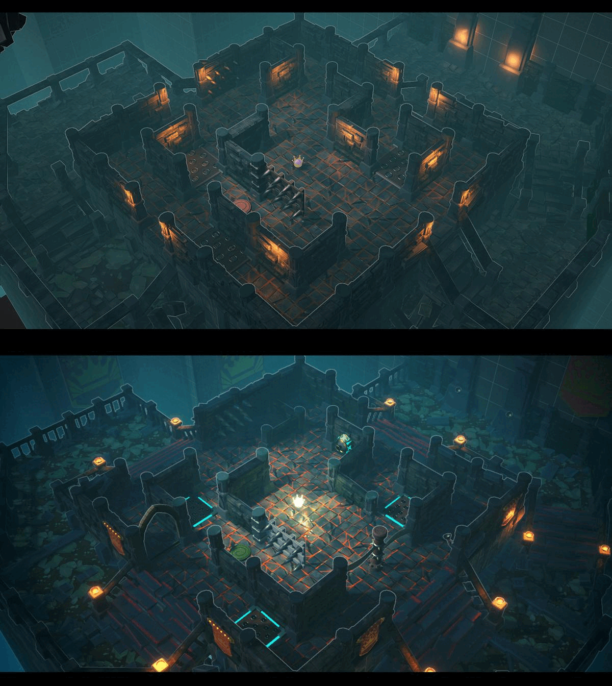
After multiple reiterations, we are convinced to have reached a better clarity regarding the visibility of paths and space in general. Awkward corners that cut off the player from the player’s own sight are altered to allow a consistent visibility. This will help to strengthen the immersive feeling of the game. Torches are used sparingly and consistent subtle and manifest colour coding are applied to the overall shading of the level. Stairs have been doubled in size and some major collision issues that quickly ruined the immersion have been dealt with. The image below demonstrates the great impact that subtle differences can have.
Refining the Ghost Shader
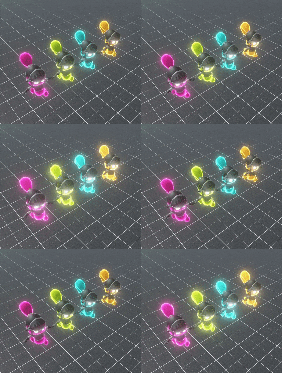
A lot of very specific needs started to rise per element. One great master shader started to become too expensive and hard to manage. We decided to build up a new set of specific shader graphs tailored to our particular needs. Smaller, yet more specific shaders allow easier modifications and very specific node setups without having to worry too much about how it will influence all the other materials based on this shader. One of the examples of such specific issues would be the way the eyes are excluded from the rest of the Fresnel based effect.
Charge Gauge
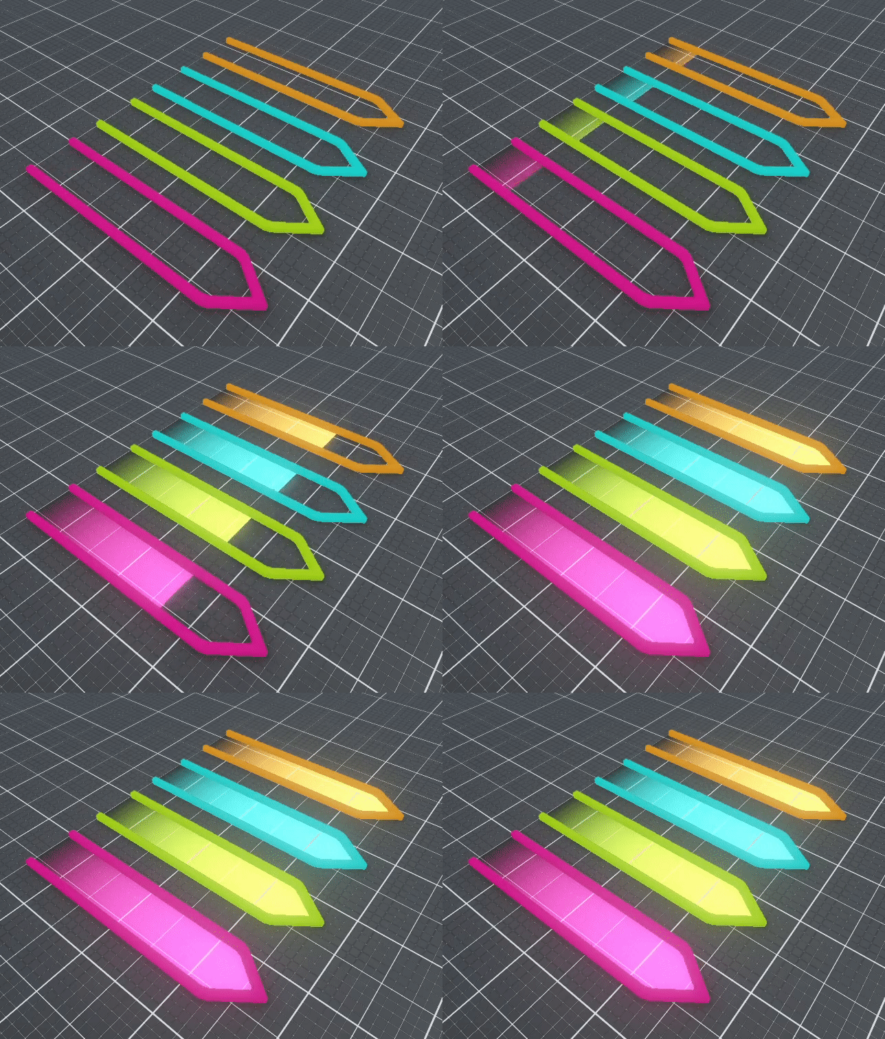
As mentioned in earlier reports, we really value the readability of our game. With this in mind, we planned early on quite a few features to support this vision. One these features is the charge bar, telling the player in which direction the charge is currently directed at and the progress of building up the charged attack. Without such a feedback, the use of such a charged attack becomes quite a bit difficult. We finally had the opportunity to start with the production of similar visual feedback elements.
Health Bar Indicator
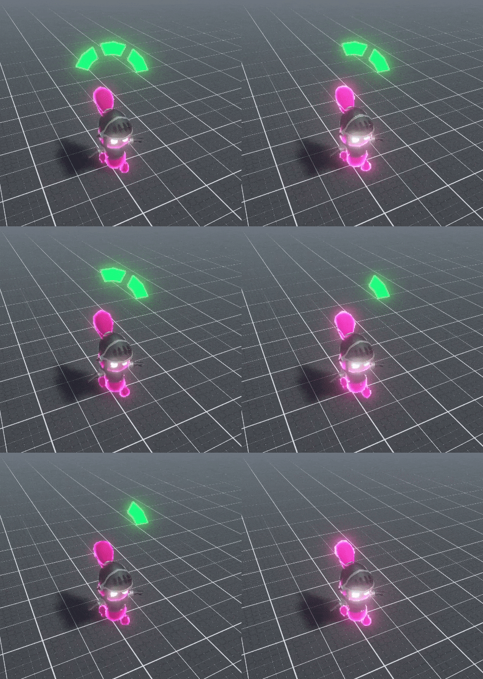
Once you become the Ghost, you gain three health points. It quickly became clear to us that there needs to be some kind of visualization of the remaining health of the ghost. Otherwise, the players don’t really seem to know whether they actually hit something or not. This seemed to be quite the necessary information to relay to the players to prevent the disruption of the immersive effect of the gameplay.
Player Status - Confused
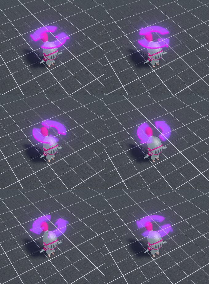
Players affected by the Ghost power ‘Confusion’ will enter the state of being confused, during which the player’s motion input get inverted. More specifically, moving upwards will make your character move downwards and vice versa. Same mechanic applies for left and right. Feedback of having entered this state is given by the use of two arrows moving into the direction opposite of what they are pointing towards.
Ghost Power - Portal
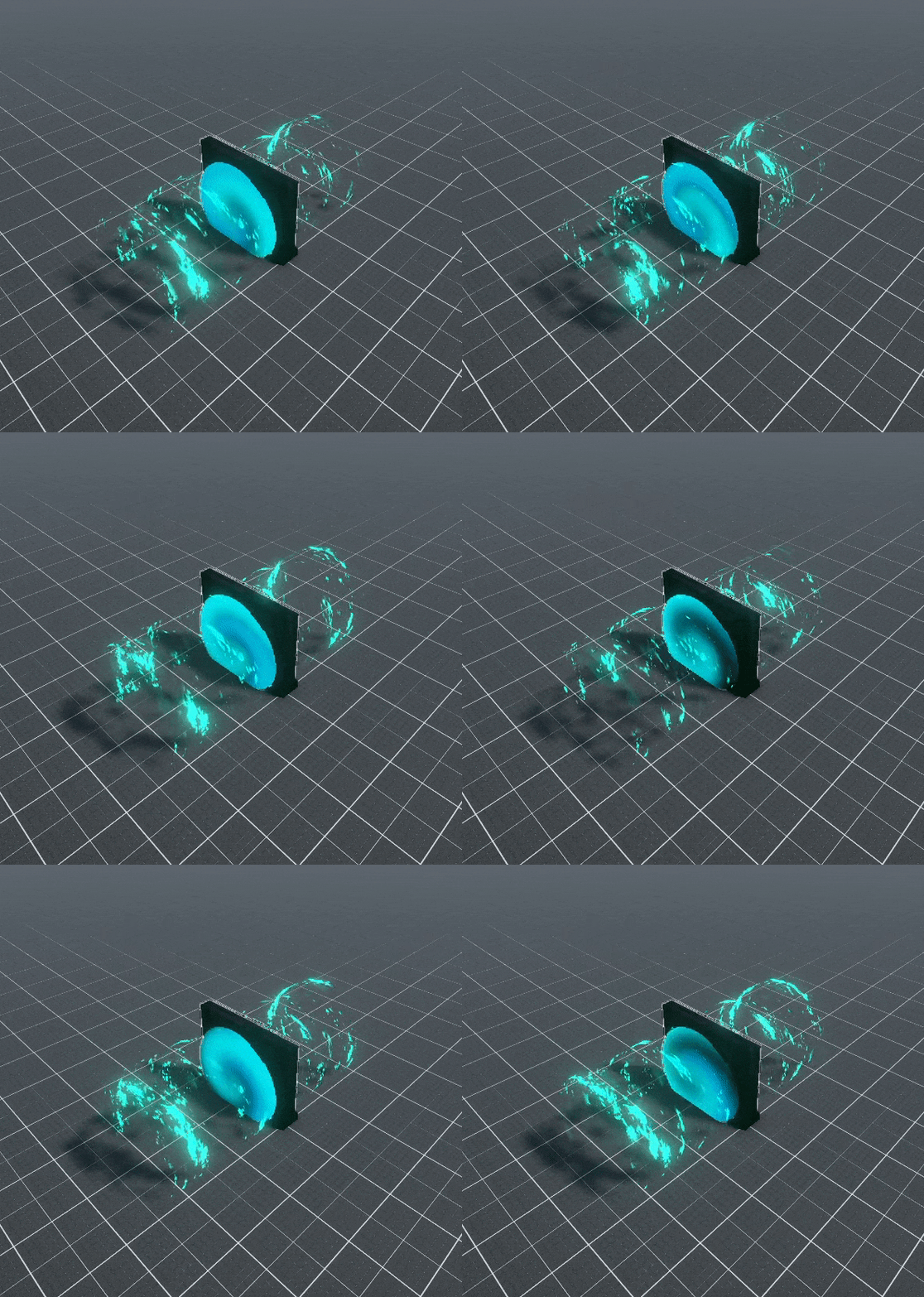
Eventually, the Ghost will be able to use the powerful ability of traversing through walls. The beginning and ending of the portal will be indicated by a blue vortex emitting particles outwards. Directionality is made more readable with this effect of emission from the portal. The visuals are done and we can’t wait to implement this power into the gameplay during the upcoming weeks.
Ghost Powers - Tooltip
There occurred a shift in how we envisioned the Ghost player’s gameplay. While we initially intended to allow the Ghost use items and traps just like the knights, we eventually came to the conclusion that it might actually be a better idea to emphasize the distinction in gameplay between the Ghost and the knights. One of the first new differences will that the Ghost will not be able to trigger the traps, nor will the Ghost be able to pick up items and thus will not be able to use any. However, our Ghost player will have immediate access to four inherent Ghost powers: Ghost Cry, Slime Pool, Confusion and Portal. This kind of access to these abilities will be balanced out with cooldowns. We hope that the Ghost player will be able to focus on actually being a Ghost and mainly concentrating on evasion rather than participating to the aggressive aspects of the gameplay. Two quick tooltip layout examples for this kind of gameplay were suggested.
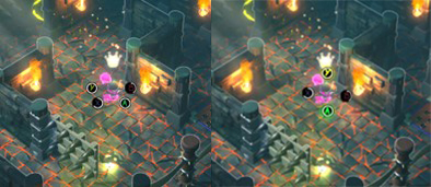
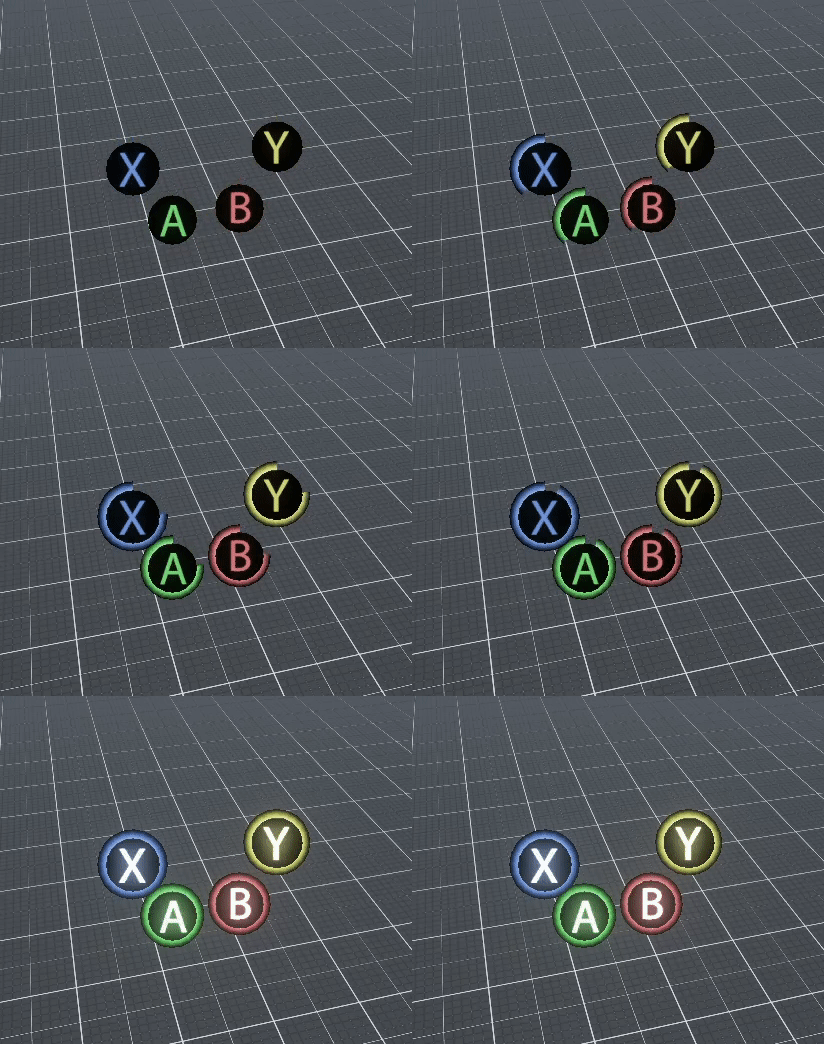
The foundation of the mechanics of such tooltips are already set up and we hope to be able to implement this feature as quickly as possible into our game. The main effects are all executed inside the Shader Graph which the materials used for these tooltips are based upon.
Knight Item - Bomb
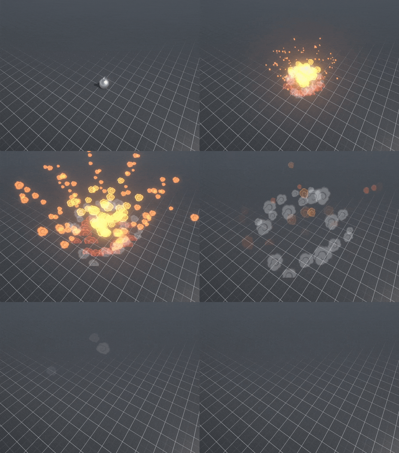
One of the items we planned on making finally got implemented into the game. The bomb item allows the player to throw a bomb to a distant location. After a short delay, the explosion will occur. All players within the area of effect will get affected one way or another. The knights will get stunned for a short period of time, while the Ghost will instantly drop the Crown.
Modelling the Details
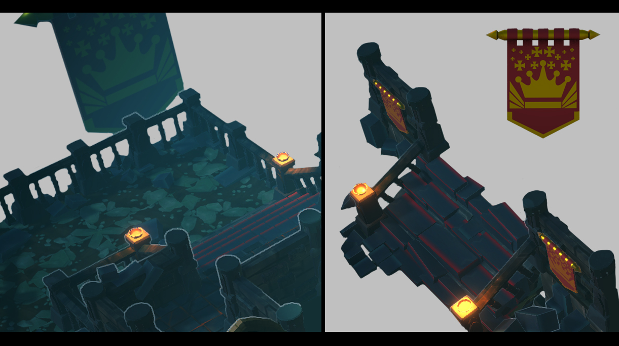
Our group decided to start the creation of assets for the environment with more detail. The more iconic shape language will start to get replaced by the intended destination style. The banners and railings are a few of the things to which we applied some polishing to add some flavour to our level and sharpen the silhouette of our main level.
UI
This past week we have been working on the menu's and in-game UI. This includes having a start screen, character selection screen, in-game pause menu and an end screen showing which player has won. Our programmer has been implementing these features and will be discussed in the programming section of this devlog. We have started by creating the 2D art for the buttons, icons and background for the UI. We'll show some of what we've made below.
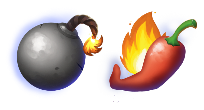
These icons will show up once the player picks up these items, so far we have the bomb item and the pepper item:
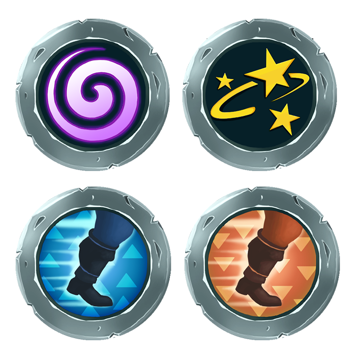
These icons will show up once the player has gained these status conditions, so far we have the confusion and stunned statuses and slow down and speed boost:
These icons will be displayed on the corners of the screen for the respective players that have these conditions. This UI will also indicate how long each player has held the crown with a gauge shaped like a sword. And a crown will be displayed for the player currently holding the crown. This will looks something like this:
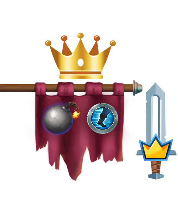
The menu layout will look something like this:
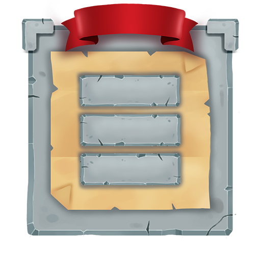
Once the UI has been implemented in the game, iterations can be made to ensure it fits the look and mood of the rest of our game.
Programming
This time around, we implemented a lot of the visuals previously mentioned in the art section. Most of the status effects are in place, along with the new charge gauge, which will give the players some nice visual feedback to help aim their dashes.
The ghost has finally received a health bar, which means you no longer have to guess how much health it has left!
We also implemented the effect for showing the winning player, which glows as a soft aura around the knight that's closest to victory, now everyone knows who to keep away from the crown at a glance!
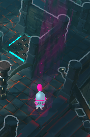
A lot of time this week has been spent on creating the main and pause menus, which don't have nice art just yet but are fully functional!
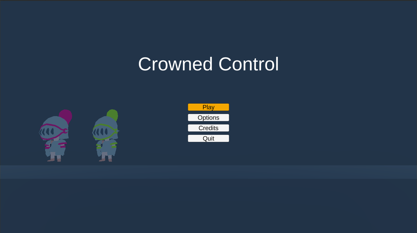
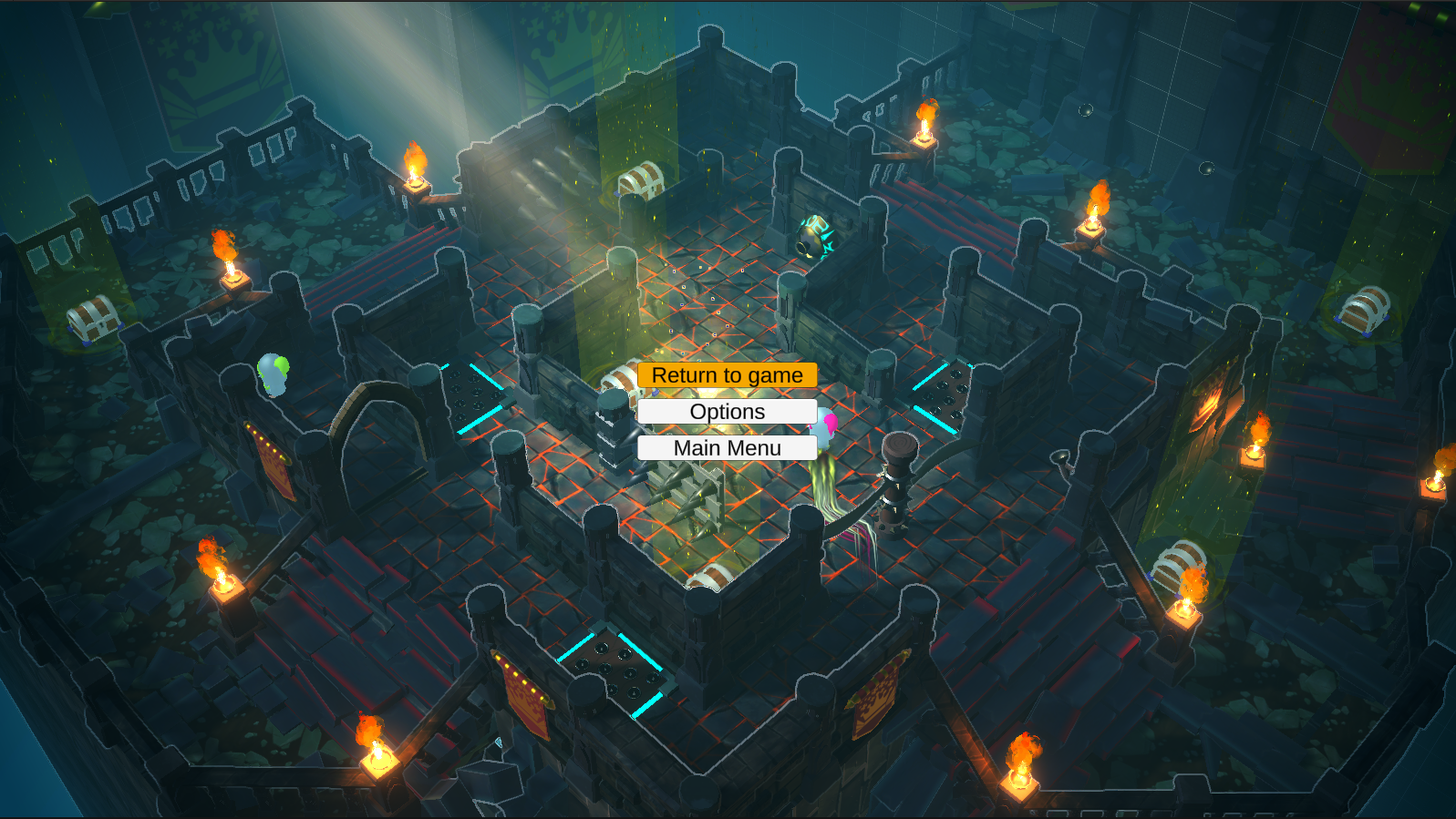
When entering the game, each player can join the main screen, where they can select a color with the left-right buttons on the D-pad. This color then assigns the correct materials for each of the abilities and UI elements, and carries over between games.
The programming section was relatively short this time, but that just means we're nearing the end of feature implementation. Next up will be the UI and HUD for our players, so we can display relevant information like items and the amount of seconds away from victory. That way the amount of guesswork required to play will be reduced drastically!
Sound Design
This week we added the final major audio component to our game so we can start with doing mixing and implementing UI related stuff.
We also made the group base for mixing. We can now add every SFX already in the game to its corresponding mixer slider and then expose the submix to the menu so players can tweak the audio to match their own preferences.

After a long period of time trying to get the animations to work, we fixed the animation controler to work properly now. The player can charge their attack and perform an attack whenever or get stunned whenever.
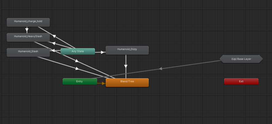
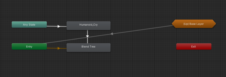
When becomming the ghost, the animation becomes more simple and streamlined, as just a move and attack is needed when you become a ghost.
See you next week!
Files
Get Crowned Control
Crowned Control
A game about teamwork, betrayal and knights
| Status | Released |
| Authors | gsteven, Aserbest, Mortepoule, Joren Dresselaers, dayellcolin |
| Genre | Action |
| Tags | Co-op, crown, knights, Low-poly, Multiplayer, party-game, Top-Down |
| Languages | English |
More posts
- Devlog #11: Polish Sprint – Week 2May 30, 2023
- Devlog #10: Polish Sprint – Week 1May 23, 2023
- Devlog #09: Production Sprint 2 – Week 3May 16, 2023
- Devlog #07: Production Sprint 2 – Week 1May 02, 2023
- Devlog #06: Production Sprint 1 – Week 3Apr 25, 2023
- Devlog #05: Production Sprint 1 – Week 2Apr 05, 2023
- Devlog #04: Production Sprint 1 – Week 1Mar 28, 2023
- Devlog #03: Game DesignMar 21, 2023
- Devlog #02: Prototype BuildMar 14, 2023
Leave a comment
Log in with itch.io to leave a comment.